Culture shock
When UK design groups work for international clients, how do they integrate local customs without resorting to cultural stereotypes?
Designing for other cultures can be like learning a foreign language. It’s not just a matter of grammar; you have to master the pronunciation, understand the nuances and be au fait with etiquette. But unlike the well-documented British aversion for learning foreign languages, when it comes to design, Britain is truly international.
According to the Department of Trade and Industry’s design policy unit, Britain is the top exporter worldwide in design and in 1998, the design sector accounted for a quarter of all overseas earnings of all UK consultancy business. It seems that a grasp of other cultures is becoming an essential design tool.
The British have always had a reputation for creativity. “The reason why we are invited to work with other countries is to try and give them a creative input [that is] different to the things they can do locally,” explains Michael Peters, executive creative director at The Identica Partnership. “Companies are often quite keen to get a bit of the ‘western’ influence, but it’s not really the western influence [they are after], they really want to develop their own culture in a more contemporary way.” So rather than a cultural hegemony, it’s the British know-how which is required by foreign clients and markets.
Still, trust and mutual appreciation need constant work. If you believe in cultural stereotypes and take a superficial view of a country’s traits you may end up insulting the client. When Identica was invited to Russia to design the identity of a vodka, Russian Standard, Peters admits he became slightly nervous. “I asked to be paid up front and for a bodyguard, since I was afraid of the mafia kidnapping me,” he says. The client obliged and Peters got a bodyguard – promptly nicknamed Boris the bear – who escorted him everywhere with a gun in his pouch. “After I had been there [in Russia] a couple of times, I realised how foolish I was… I felt terribly embarrassed.” Peters soon redeemed himself by creating a brand that would represent Russian heritage and still have a modern feel. The shape of the bottle is influenced by the Kremlin, while the logo is inspired by old manuscripts’ type. “It’s important to listen, to study the culture, for those are the symbols that are recognised,” says Peters. “What you bring in those cultures is all the techniques of packaging and branding. They give you the history and culture of the sector, how you blend it together is what makes it a success.” Still, a clever use of stereotypes can sometimes help. For Finnish beer Lapin Kulta, Design Bridge used a midnight sun scene on the pack. This struck a chord with Finnish consumers who recognised and appreciated the reference.
Although another culture’s visual heritage can be an inspiration for designers, it’s important not to abuse it. When design consultancy Furneaux Stewart was appointed last July to develop the graphic, signage and brand for an Australian Aboriginal art exhibition, it was careful not to be inadvertently sacrilegious. Part of a season of events at the London Commonwealth Institute, the Our Story is in the Land exhibition features a dazzling showcase of Australian art, characterised by a graphic representation of ancestors. “The main thing that we had to understand was the art itself, and the spirituality of those images,” explains Laurie Stewart, design director at Furneaux Stewart. “The images are so beautiful that as a designer, you are very tempted to pluck out details… you want to use them large, as a background, as a pattern, and, of course, you realise you can’t, because they have deep meaning.” As a result, the consultancy has adopted “the essence of the art as a whole, the simple linear images and dots and lines, rather than just copying”.
The exhibition design reflects the colours and shapes of the aboriginal art, but still remains deeply respectful of its religious implications. To help cultural understanding, Furneaux Stewart collaborated closely with a project manager who had direct links with the aboriginal community. “She was a sort of translator,” says Stewart. “She would brief us, make us aware, tell us what the stories [depicted] meant. Through her, there was a constant feedback with the community, which would in turn check what we did, tell us if there was a point we had missed.” With such an arrangement, the Aboriginal community felt it had a voice in the way it was represented to European eyes.
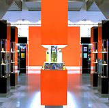
In countries where religion is an integral part of every day life, designers need to acknowledge its customs and rules. Factors such as prayers, ablution rituals and the gender divide all require careful consideration. When architect and interior design consultancy Hosker Moore & Kent was appointed to design the interiors of Harvey Nichols’ store in Riyadh, Saudi Arabia, they banked both on a previous collaboration with the store for its branch in Leeds, and a knowledge of the Arab market. Located within Sir Norman Foster & Partners’ Al Faisaliah development, the 8000m2 store – which opened in May – is Harvey Nichols’ first international branch.
“It was very interesting to bring the Harvey Nichols’ brand to Saudi Arabia,” says Christian Papa, design director at Hosker Moore & Kent. “It seemed surreal, the whole idea [of promoting] fashion and sex!” The rigid male and female divide in Saudi Arabia had a dramatic effect on the way the space was arranged. The restaurant area is designed with an element of separation – between the man and the family – in mind. But to add another level of complexity, the division of the area has to be mobile, since during the weekends, which start on Thursday, there are more families, while during the week, the store is mainly visited by men. Papa solved this with a system of curtains which are translucent at the top to show the store, and opaque at the bottom. Prayer rooms are also provided for, as well as drivers’ lounges for the women’s chauffeurs (women in Saudi Arabia are not allowed to drive). The beauty hall on the ground floor sells cosmetics, perfume and accessories. “But if the women want to try on the cosmetics – after all, make up is about test and play,” says Papa, “they are invited into an enclosed beauty area, where they can try a lipstick, ask for skincare advice or have a manicure.” The same division of space is operated in the womenswear department, where women can try on swimwear, hosiery and lingerie in an enclosed part, a sort of women’s club. Small details all around the store continuously reinforce the Saudi Arabian location. Risqué fashion or cosmetic campaigns depicting scantily-clad models are a no-no, while personalised shopping service – a Harvey Nichols’ trademark – is conducted in luxurious facilities, fit for the various Saudi princesses who order entire collections. Yet Hosker Moore & Kent is keen to stress it did not fall prey to an “Arabian Nights cliché”. “The result is a very modern retail environment, where the Harvey Nichols’ spirit has been maintained,” says Papa.
Transporting a British brand abroad can be full of complexities, but what happens when a British design consultancy is employed to promote an Italian brand in Japan? Giles Marking, senior executive vice-president at Fitch, was appointed two years ago to design a series of Segafredo cafés in Japan. In order to present an idea of Italian culture, Fitch tried to discover what the Japanese thought it was. Focus groups’ results were both fascinating and predictable. Italian men are seen as wonderful lovers but not very trustworthy, while Italian women are perceived as well-groomed, but with bad time keeping. Moreover, Italy is seen as a dynamic and stylish place; Alessi coffee pots, Ferraris and sharp modern design are all mentioned. Marking set out to design a retail area that would follow these requirements. We wanted to create a modern Italian environment that opposed the more traditional coffee shops – the dark wood, opera music side of Italy,” says Marking. Because the Japanese view the Italians as creative and free thinking, the Segafredo cafés all have a curvy counter and a predominance of red hues. Soundbites of Italian language on the walls, “It’s very trendy to speak”, according to Marking, and a generous use of space, all contrive to do the Italian job. The chain now has seven sites across Japan – the last one opened this July, and a total of 25 cafés are planned.
Inevitably, different cultures require different design approaches. In Israel, Identica has just launched the new identity for Internet portal Walla! – which in Hebrew slang means something like “Oh really?” Peters says: “Unlike in Russia, where you pay attention to the past, in Israel you must pay attention to the future.”
Peters says Israel is one of the most dynamic cultures in the world, a country rich in technological innovation and talent, thanks to its mix of Jews, Muslims, Christians, Lebanese, Russians and Americans, among others. It is a small, young country with a huge consumer culture.
Politics in Israel play an important role. “Because you have an interesting blend of people, when you develop a brand the sensitivity you have to adopt is enormous,” says Peters. “You are equally working with Jews and Arabs, therefore the word of Allah and the word of God have to be treated with the same kind of sincerity. In the world of branding, politics play a greater role [in Israel] than in any other country.
When you are working on a portal – which is, after all, recent 21st century technology, you have to create a dynamic brand, since the Israelis won’t let you get away with anything which isn’t new, state-of-the-art and completely different… they demand that you use the background of their history, but also their modern background as innovators,” adds Peters.
To reflect Israelis’ forward thinking, the Yalla! identity changes constantly. Although there is a common logo, every day there are over 100 different symbols that represent the brand, which change every half day, and then every hour. “This is Israeli thinking: if we are going to be in the world of Internet, an information channel that changes all the time, our identity cannot be static,” says Peters. Once again, says Peters, a European, “old world” approach would not have met the brief. For even in our globalised times, each country is another country, with its own rich identity from which to draw inspiration.
Read this next

-
Post a comment


