Me & Dave homes in on Singapore market

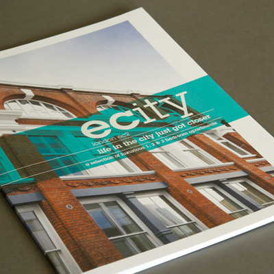
Me & Dave has named and branded E City, a new luxury apartment complex based on east London’s Old Street that is being marketed to the South East Asian market.
Appointed by developer Tudorvale in January following a pitch, the consultancy was asked to address affluent buyers through branding and advertising for a Singapore launch, which takes place on Saturday.
E City’s name represents ’proximity to financial districts and educational facilities’, says consultancy senior designer Richard Stevens.
The identity uses a slab Lubalin Graph font and a mix of weights across the typeface to highlight the ’c’ and ’e’.
Stevens says print brochures are still an important requirement for property branding, but that the consultancy has tried to move away from conventional brochure design. ’We’ve printed on Horizon uncoated stock and it’s smaller than the usual A4 magazine format. To add some personality we’ve included infographics,’ he says.
A blog has been designed to help drive online sales and although Stevens says it is expected that all the apartments will be sold in Singapore, this has been designed with universal appeal and will target UK consumers if some are not sold.
The blog approach is more immediate than a full website and better suited to the exhibition launch, says Stevens, who has designed the site to work across all Web and mobile platforms.
Exhibition graphics, signage and pop-up stands have been designed with a succession of Singapore launches in mind, starting this Saturday. These are ’image-heavy, set the scene of the area and show floor plans’, says Stevens.
Branding for foreign buyers is essentially based around the same core proposition as UK customers, Stevens says, ’although this is more direct and a little less emotive’.
-
Post a comment


