Identity prescribed for Drugstore
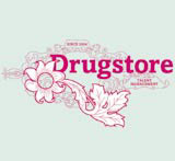
Arthur Steen Adamson has created an identity for talent management company Drugstore.
The business aims to provide freelance ‘communications talent’ across advertising, PR, branding and digital media and launches this month.
Arthur Steen Adamson creative director Marksteen Adamson says the group was briefed to design an identity that represented the Drugstore name in ‘the American sense of the word [offering a wide range of everyday goods], as opposed to the colder, sterile, medical sense’.
It was also important that the identity conveyed the company’s culture, one that ‘doesn’t take itself too seriously and isn’t too corporate but is understated, with a relaxed informality’, he adds.
The work is inspired by visual imagery used in the ‘typical, early 20th century American drugstore’ and the identity reflects the ‘intricate and elaborate designs of that period’, explains Adamson.
A colour palette of bright magenta juxtaposed with ‘rich’ grey brings a modern aspect to the look.
Read this next

-
Post a comment


