Giving a Fig about movie sequences
The title sequences to two new films, Circus and High Fidelity, have been created by Richard Morrison of screen graphics consultancy Fig.
New Brit-flick Circus, set in the Brighton underworld away from the funfairs and pier shows, is a crime thriller and black comedy. In it, the characters – including John Hannah, Amanda Donohoe and Eddie Izzard – cross, double-cross, then triple-cross each other.
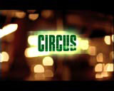
The credits open with a bleak web of cast-iron girders beneath Brighton Pier, representing the elaborate, underworld plot. The camera then picks out the coloured lights of the pier before spinning off to create fast-moving, abstract imagery from the blurred lights.
According to Morrison, the circular movement reflects the characters’ mistrust of one another. ‘I used a live action shoot under Brighton Pier, and decided to manipulate the fun-fair lights rather than neon lights, which can look clichéd. What I got was a visual representation of the plot – that no one is who they seem,’ he says.
The solid typeface used – Compacta Bold – is common to all the credits and contrasts the out-of-focus lights. These are also highly animated, and spun round the screen in all directions. The sequence is complemented by a thumping, fast- paced House soundtrack.
High Fidelity, adapted from Nick Hornby’s best-selling novel, follows the life of a 30-something, record shop-owning music obsessive, played by John Cusack.
Terrified of commitment, the hero spends his life constructing lists and memorising record catalogue numbers.
The novel is set in Highbury, North London, but the film, directed by Stephen Frears, has been relocated to Chicago.
The short, abstract opening sequence features a revolving vinyl disc shot in dark blue and black, setting the scene for the character’s obsession with records. Unusually, the 12-second front only features the film title and the production company: the credits appear after the film.
These re-create 1970s and 1980s music ephemera – the character’s favourite era – in the form of a different distressed fly poster for each cast and production member. The imagery and typography are unspecific enough to be relevant to any urban environment – be it North London or mid America – and are suitably run down to represent general inner-city gloom.
‘I created my own artwork rather than base the posters on existing paraphernalia to lend the closing sequences an abstract feel, and to overcome copyright issues,’ says Morrison. He even includes himself in the credits.
Morrison looked to record covers of a variety of different music genres for inspiration, and was particularly influenced by the bold simplicity of the classic Blue Note typefaces, echoed strongly in the High Fidelity title sequence.
A constant in each credit is the revolving vinyl disc in the background, giving each shot movement. Rather than take centre-stage as it does in the opening, the vinyl takes a back seat, echoing the earlier imagery.
Circus
Client: James Gibb, David Logan – Columbia Tristar
Design: Fig
Director: Richard Morrison
Producer: Dina Johnson
High Fidelity
Client: Stephen Frears – Touchstone Pictures
Design: Fig
Director: Richard Morrison
Producer: Dina Johnson
Graphic designers: Mark Barrow, Dean Wares
Read this next

-
Post a comment


