MTA Design refines identity for ADNOC
MTA Design has completed a rebranding of the Abu Dhabi National Oil Company, the largest fully integrated oil company in the United Arab Emirates.
The company is involved in the worldwide exploration, extraction, refinement, distribution and retailing of oil.
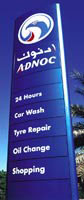
The London group beat Wolff Olins and Landor in a five- way pitch in 1998 to reposition ADNOC’s corporate and retail brands. This included a redesign of its existing service station network and distribution tankers.
Like the country’s national symbol, the company’s logo was a falcon with spread wings. But MTA has altered the marque, claiming the attitude and presentation was “too authoritarian and old fashioned”.
“The solution was to modernise the falcon, creating a stronger, more visible symbol which supports the repositioned ADNOC brand values,” explains MTA managing director Ibrahim Ibrahim.
“We wanted to position ADNOC as a company that is alert and responsive to customer needs. This is captured in the new marque by illustrating the falcon at the point at which the hood is removed before hunting. It is then that the falcon is at its most alert and perceptive.”
Company uniforms, corporate communications materials and packaging for 125 branded lubricants have also been redesigned.
Read this next

-
Post a comment


