NB: Studio identity for Australian sushi exporters
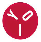
NB: Studio has designed a corporate identity for an Australian company which exports produce for the Japanese sushi market. Brisbane-based Yoi Pry launched the identity last week and it will roll out on stationery, transport and packaging. ‘The brief was to create a friendly marque as Yoi means good in Japanese, while the red circle represents the Japanese flag,’ says NB: Studio partner Alan Dye.
Start the discussionStart the discussion
-
Post a comment


