Attitude adjustment
Yolanda Zappaterra takes in all the events and publications that are celebrating the punk movement 25 years on and what effects it had on the era’s designers
It was inevitable really. Having plagued us with general decade-long trawls through the latter half of the last century, our low-culture historians – publishers, TV producers, gallery owners and the like – were bound to start honing in on specific movements.
And while the 1970s fest fell flat before it ever really got going – a triumph of good taste over bad marketing – a gem was found in its rubbish: punk. Thus the next few weeks will see the publication of two big glossy books, Punk by Stephen Colegrave and Chris Sullivan and The Clash by Bob Gruen, along with a range of tie-in events and releases, including the opening of two exhibitions, a Punk CD and a Punk boxed set of four films on DVD. But what of punk graphics? Surely such a powerful, integral part of the revolution that dominated the Queen’s Jubilee year has a large part to play in any pogo down memory lane?
The portents looked good in July, when trendy printer and gallery space Artomatic caught the spirit of the time with a retrospective of the work of Barney Bubbles, designer of the The Damned’s Music For Pleasure (1977) album and a huge range of Stiff records material, including the gloriously witty mock-Cubist Blockheads logotype. But then, nothing. Bubbles sadly died in 1983, but his punk and post-punk peers – Jamie Reid, Malcolm Garrett, Rocking Russian Al McDowell, Geoff Halpin, Neville Brody and Peter Saville – all continue to create great work. And while their original output may not be receiving the recognition it deserves, it undoubtedly has had a lasting impact on their professional and personal lives, and on design in general.
Influenced initially by the music, Russian Constructivism, Pop Art and Terry Jones, founder of ID magazine, Al McDowell, also known as the Rocking Russian, emphatically agrees that the work he did then still has a relevance and bearing on his work today: ‘In attitude, absolutely. I always considered myself to be an untrained charlatan in graphics, but the attitude was pure,’ he says.
McDowell draws a direct line from current work – as a production designer for such movies as The Crow, Fear and Loathing in Las Vegas and Fight Club – to the past, beginning in 1976 with Russian revolutionary motifs and Eastern bloc propaganda for Stiff artists and continuing with the ornateness of art nouveau covers for the likes of Siouxsie and the Banshees. ‘I met Malcolm McLaren and the Sex Pistols when I booked them to play at Central St Martins School of Art & Design, where I was studying fine art, and that led to printing T-shirts for Seditionaries,’ he recalls. He went on to work with Siouxsie, The Clash, Fad Gadget and Iggy Pop before moving into music videos (working with Jones and John Warwicker of Tomato along the way), ‘from where it was a short step into commercials, then movies,’ he explains.
Garrett too found punk’s attitude professionally liberating. He is now chairman of digital media group AMX, after 17 years as design director of design group Altered Images, but 25 years ago he was a student into the edgy side of pop like Led Zeppelin and Hawkwind. Then he discovered punk. ‘The big thing about punk – both personally and generally – was the way it opened doors,’ says Garrett.
‘There I was in the second year of college shifting from creating my own fledgling Dadaist movement to designing sleeves for the Buzzcocks. There’s no way I would have been able to get into those creative support industries for music before, but a freshness reinvigorated all the creative fields, so much so that a lot of in-house art departments were disbanded in favour of creative partnerships.’
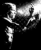
One of the most famous creative partnerships was the one between the Sex Pistols and Reid, the designer who epitomised the DIY nature of punk with cut-out newspaper text, collage and the infamous safety pin through the Queen’s lip. His style is what we all remember about punk, but surprisingly McDowell, Garrett and even Stefan Sagmeister in the US reject that Reid’s style is the punk aesthetic. ‘It’s about spontaneity, subversion, confidence, and change, not ransom typography, safety pins and mohawks,’ insists McDowell. ‘Here in the US I think punk had a huge impact on everyone’s work, but driven by the New York fanzine scene – the make it fast/ cut-and-paste approach – rather than Reid’s political agitprop UK style,’ says Sagmeister. Indeed, in the US the impact of punk went beyond design, influencing such artists as Jenny Holzer, who has said that her distribution of aphorisms on stickers and flyposters was influenced by the New Wave scene’s DIY style and its distribution.
However, there was one factor that did influence everyone involved in punk’s visual representation: the music. Ray Lowry, cartoonist and illustrator of, among others, The Clash’s album cover London Calling, remembers ‘seeing The Clash and having this epiphany watching Joe Strummer, who just blew me away. Then seeing the Sex Pistols on the Anarchy tour and discovering this whole ethos around the freedom to be wild and different.’
‘There was an incredible sense of empowerment,’ says Garrett. ‘The excitement of going out looking the way you did and feeling you knew something that other people didn’t was very different to current youth culture, because the culture of rebellion now is the mainstream.’
Garrett’s position in punk graphics history is undeniably up there with Reid’s, but for very different reasons, not least because, graphically, the ‘wilful eclecticism’ of his work (as described in Philip Brophy) has had a far greater impact on design. ‘Anything and everything informed my work at the time,’ says Garrett. ‘Fine art references from Pop through to Dada, design from the Bauhaus and Constructivism, the work of Jan Tschichold and junk typography, ephemera and 1960s modernism. For example, one very important reference was a movement in interior design called hi-tech, where designers repurposed industrial design in the urban environment – Ben Kelly was doing it in shops in London’s Covent Garden, I was doing it on Buzzcocks and Magazine sleeves and Peter Saville was doing it at Factory Records. And now half the sleeves you see in Virgin Megastores and HMV reflect that,’ says Garrett. Lowry similarly recalls fine art influences such as Edward Munch and Van Gogh alongside Reid’s posters and the anti-design ethos of fanzines such as Mark Perry’s Sniffin Glue. ‘That’s something I’m revisiting with a new CD sleeve for a young Belfast band, where I’m mixing photography and handwritten text, but don’t even know the format details – all very punk,’ says Lowry.
Lowry’s literal return to the essence of punk is not a journey that Garrett is interested in making, but he agrees that punk is still relevant. ‘The relevance was attitude. I sensed a revolution and wanted to put in my two penniesworth – and my abandoning of print for digital media is the same thing. I was never hung up on the components of revolution, just the nature of it.’ says Garrett. Which, however much old punks will hate the books Punk and The Clash, they are the most appropriate of the current reminiscing vehicles, for the subject matter may be 25 years old, but the products are bang up-to-the-minute. A sad indictment of Garrett’s astute take on the long-gone culture of rebellion.
Punk opens on 18 October at Apart, 138 Portobello Road, London W11. The Clash by Bob Gruen opens on 27 September at Proud Camden Moss, Greenland Street, NW1
‘Why is it that nobody ever comes to people like me, Jamie Reid and Al McDowell when they’re putting these books together?’, asks Malcolm Garrett in response to the news that next month sees the publication of Punk, written by Stephen Colgrave and Chris Sullivan and designed by Beatles Anthology designer Wherefore Art?.
Garrett’s complaint may sound arrogant, but given that the punk graphics created by Garrett, Reid, McDowell and a handful of others were so instrumental in the creative revolution that was punk, and in view of the fact that Punk is a weighty, glossy tome that’s trying to convey that attitude of punk through its imagery and chief protagonists, it’s a good question, and one that I put to Wherefore Art? design director David Costa. ‘Initially we explored “reproduction punk” using those acceptable cliches of anti-design, noise and artlessness, but Colegrave very clearly envisaged something that didn’t emulate or copy the look of the time. What he wanted was an intelligent overview, so the decision not to incorporate those graphics was a conscious one,’ he explains. Costa and his team took less than two months to realise Colegrave’s vision.
Punk purports to tell the story of the movement from its US roots – Andy Warhol, The Velvet Underground, the New York Dolls, MC5, Iggy Pop and the Stooges – through to its transatlantic voyage to London and the suburbs, where people like Siouxsie Sioux and the Sex Pistols enthusiastically embraced this revolution of nihilism, noise and style.
The writers are proud that punk’s story is told not just by them, but by some 100 contributors who, according to the press release, ‘made and crafted punk’. It’s a strange list, notable more for its omissions than inclusions – no Mark Perry, Malcolm McLaren, Julie Burchill or Pennie Smith, but some oddities here to maximise sales on both sides of the Atlantic, including Legs McNeil, widely recognised as the man who coined the use of the term ‘punk’ in connection to something other than James Cagney movies or male prostitutes.
In narrative it’s straightforward, a chronological journey from 1975 to 1979 illustrated heavily with many previously unseen photos, soundbites, pull quotes and newspaper clippings, all laid out using an array of typefaces in an eye-popping range of weights, sizes and leading. The overall effect is of a mass of information clamouring for attention, coffee-table dipping at its best – or worst. What little graphics there are – Tom of Finland’s famed cowboy T-shirt, Sex Pistols posters, Buzzcocks covers – are uncredited, their part in the sheer shock factor of punk largely glossed over in favour of photography and fashion’s involvement in it.
After 25 years it’s hard to remember quite how shocking punk was, and the book goes some way to illustrate that – a remarkable quote from GLC member Bernard Brook Partridge in the book reminds us, ‘Most of these groups would be vastly improved by sudden death’. And you have to laugh at the irony of a 400-page coffee-table punk book, but if you’re looking for tales and graphics from the coalface, you’re best off investing in any of the books listed in Punk’s bibliography, and while you’re at it, try and lay a hand on the Incomplete Works of Jamie Reid by Reid and Jon Savage – it’s a content heavyweight to Punk’s flyweight.
Punk by Stephen Colegrave and Chris Sullivan is published by Cassell & Co in October, priced £35
-
Post a comment


