Design Bridge redesigns 60-year-old gin bottle

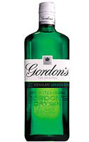
The UK’s biggest selling gin brand, Gordon’s, has been redesigned for the first time in 60 years, by Design Bridge.
Work, which includes revamped graphics and a new bottle shape, launches in April and will be supported by a £15m relaunch campaign. There are no plans to redesign the international version of the brand, says Gordon’s gin marketing manager Alex Tomlin.
The consultancy, which conducted over nine months of research into the product before beginning design work, was briefed to make the brand more contemporary so as to target a younger audience, comments Design Bridge account director Andy Paul.
‘There is a huge amount of goodwill for the brand, but it was looking a bit outdated and had been copied by own-label. We have taken the good bits and built something more ownable into it,’ says Paul.
The redesign retains the traditional green, black and white livery, but incorporates a more contemporary feel for the graphics. The bottle is taller and has embossing on the front and back and four new back labels have also been designed.
‘The [work] has resulted in a fresh new design that optimises Gordon’s equity and ensures a clearer, more confident presence in the onand off-trade. The new pack is an exciting leap forward and represents an important part of our hard-hitting marketing plan to make consumers feel great about the brand and the category,’ says Gordon’s brand director Wendy Darlington.
The group, which was appointed in May 2000, won the work via a creative pitch. Graham Shearsby and Neil Hirst led the project.
-
Post a comment


