Show of force
Pamela Buxton takes a look at innovations in materials used to display exhibition graphics
Exhibition graphics are getting more interesting. Gone are the days when straightforward text on wall panels was all that was expected. Now, with graphic designers more likely to be involved earlier on in the exhibition process and increasingly taking advantage of printing innovations, text is being applied to all sorts of surfaces in all kinds of ways. Rubber, cherrywood, linoleum, plastics, neon – you name it, they’ve all been used recently as materials to create graphics for exhibitions.
‘It’s now possible to print digitally on pretty much anything and the resolution now is really pretty good. It opens up all sorts of opportunities,’ says Ross Hunter, managing director of Graven Images, who printed graphics directly on to the plywood structure of Re:Motion, an exhibition for Glasgow’s Lighthouse at the Rotterdam Biennale.
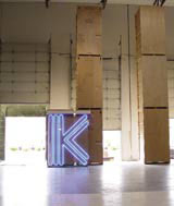
‘It’s very exciting at the moment because you want to use lots of different materials. And exhibitions allow you to do that because you can take risks as it’s temporary,’ adds Morag Myerscough, whose recent work includes exhibition text executed in linoleum and neon – the latter was used primarily for its ability to create impact and presence at the British Council and Department of Trade and Industry’s UK stand at the recent Home Entertainment show in Los Angeles.
But while it’s more tempting than ever to get carried away with the possibilities, it’s even more important that adventurous materials should have a relevance to the context of the exhibition or run the risk of attention-grabbing incongruity.
‘We’re always very aware that there needs to be a reason with relevance to the core idea. We’re not pushing using materials for effect,’ says Paul Davis, creative director of Agenda, which has recently worked with architect Stickland Coombe on a design incorporating text printed on rubber for the new exhibition Out There at the Crafts Council.
The decision to use rubber came from a desire to avoid an overly theatrical approach to the subject matter of crafts for the outside (obvious devices such as garden fences were ruled out), but to find a way of presenting text that tied in with the subject matter. The solution was rubber since, explains Stickland Coombe partner Nick Coombe, it’s an outside, waterproof material. This was specified in green and black Dalsouple rubber. The exhibition text is screenprinted in white directly on to the rubber sheets which are then wall-hung.
For touring shows, the need for graphics to be integral to the physical structure of the exhibition is more acute and is one where the new technique of printing on to solid substrates comes into its own. Graven Images’ design for Re:Motion demonstrates how graphics can be treated as an integral part of the whole exhibition design rather than as a last minute add-on. The designers drew the components for the eight, birch-ply ribbed structures that make up the exhibition system in Illustrator and introduced graphics into that, printed on to the plywood then passing the ply on to be cut to their specification with the graphics already in place.
‘It’s a real convergence of engineering components and graphics,’ says Hunter. ‘It’s very nice to be able to put text and image directly on to real materials rather than on to paper first.’
Home Time, a British Council exhibition touring China in the autumn, promises to do just this with aplomb. Studio Myerscough based the exhibition layout on a traditional Victorian house containing eight exhibition rooms each designed by leading UK creatives including Fat, Ben Kelly, Tom Dixon, Michael Marriott and others. In keeping with the exhibition theme, Morag Myerscough came up with the concept of picking out the exhibition name in tiles in the manner of the black and white patterned hall floors of the time. To get this effect, she chose lino tiles to spell out Home Time in English like an entrance mat. In China, these will have a decorative function as few read English – the Chinese title is in laser-cut yellow tiling. Within individual rooms, Studio Myerscough is collaborating with the designers for the most appropriate application of graphics – for the Fat-designed Posh & Becks bathroom, they might be embroidered on the towels while Tord Boontje’s boudoir may have text screen-printed on to dresses.
Working with architect Muf, Una Design also applied graphics directly on to the exhibition surface at the recent Gainsborough show at the Royal Academy. Its approach was to remove all text from the walls and put it on to specially designed furniture in the form of cherrywood reading tables. Text was screen-printed in white on to the reading tables and juxtaposed with books and recreated newspapers of the day.
This direct approach isn’t always possible. For the British Council’s touring show Posh – about how traditional luxury brands are reinventing themselves – Una Design’s graphics are contained within an acrylic exhibition structure created by Stickland Coombe. Conceived as a giant crystal chandelier, the structure accommodates display boxes and panels where graphics can be slid into the rhomboid structure in the appropriate language.
Graphic Thought Facility has always been interested in appropriation of different materials and techniques and its exhibition work is no exception. ‘We don’t like to resort to graphic wall panels, we’d rather work off the structure of the shows,’ says GTF’s Huw Morgan. But GTF makes sure, he adds, that the result is appropriate to the content of the exhibition. For the Manchester gallery within the Manchester City Art Gallery, for example, it used enamelled signs of the sort normally used for underground stations.’It’s just a really beautiful, industrial process appropriate to an industrial city,’ he says.
For the Peter Saville show now on at the Design Museum, GTF had the difficult task of creating exhibition graphics for a cult figure in design. Their solution was to use mirror – commissioning a portrait of Saville in profile and applying this to a series of mirrors at the entrance to the show to give a deliberately Warhol-esque effect.
Adventurous approaches and materials can also be high risk. Visitors to London’s new Fashion and Textile Museum are confronted with floor-mounted graphics executed in hand-built plastic letters for the inaugural exhibition My Favourite Dress. Created by Kerr Noble and Thomas Heatherwick, the text looks great illuminated within the gallery, but requires considerable perseverance to read.
Sometimes text on the wall, rather than quirky materials, is the answer and more appropriate to the subject matter. It needn’t be dull though. For the Hella Jongerius exhibition opening this month at the Design Museum, Kerr Noble’s invitations punch the exhibition title out of a flocked leaf which gives a tactile quality suitable for Jongerius’ combination of the contemporary and the hand-crafted.
Budget and client permitting, designers of exhibition graphics have more freedom than ever before. But as with any new toy, there’s always the danger of mis-using the new possibilities. As Graven Images’ Ross Hunter says: ‘People will get carried away until they figure out what should be used.’
Read this next

-
Post a comment


