Interbrand restyle for Barclaycard
Barclaycard is set to unveil a radical restyling of its card and visual identity by Interbrand this week, as part of a multi-million pound bid to reach more wallets.
The move is a response to market research, which identified that consumers want the brand to act as an ‘enabler’ through life, explains Barclaycard marketing and communications director Alison Hutchinson.
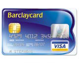
Interbrand has retained Barclaycard’s blue and gold brand colours, but introduced a logo that operates as a word marque and as a credit card, says group creative director Jonathan Hubbard. ‘It was really an opportunity to simplify,’ he says, adding that the word Barclaycard, traditionally written in capital letters, is now rendered in a combination of upper and lower case letters.
‘It’s shorter and easier to read, but we’ve given it stature by enclosing it in the [graphic] element,’ he says.
Hutchinson says the design brief was ‘all about maintaining the heritage of Barclaycard, but also being more progressive, transparent and fluid, and enabling people’s opportunities’.
The new-look identity (pictured) rolls out, from this week, across the Barclaycard range of credit cards, stationery, statements, advertising, direct mail and the brand’s website. An international launch is expected later in the year.
-
Post a comment


