Delta opts for softer Landor look
US aviation group Delta Airlines has unveiled a new corporate identity, designed by Landor Associates, as part of its global passenger-focused rebranding programme.
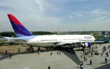
The redesign, which will be rolled out globally on planes, vehicles and communications materials, drops the words “airlines” from the logo, and displays the word Delta alone.
Landor has maintained the company’s triangular “widget” logo, but with rounded edges, while the traditional dark blue and red colouring has also been retained.
Delta executive vice-president and chief marketing officer Frederick W Reid explains: “Ultimately we are evolving as an airline and our look has to evolve with it. We recognise the emotional connection that loyal passengers and Delta employees have with our logo and name as core elements of our brand, and changing them was not a decision we took lightly.
“We saw the positive effect of presenting a softer visual image and capitalising on the single word Delta as one of the airline world’s most recognised brands. The new look builds on an illustrious heritage and positions us for the future.”
Landor executive creative director Richard Ford says the consultancy’s work is a development of a project carried out several years ago.
“We are delighted that the airline recognises the importance of its brand when communicating to its audience. We worked with Delta in the mid-1990s to clean up the look of its fleet and brand system with an interim visual solution. But what it is now introducing makes a dramatic statement, and it aligns the look of the brand with its positioning as a customer airline,” he adds.
-
Post a comment


