
Royal Institution’s colourful, illustrated identity for its family programme
The branding has been created by Supple Studio, and is centred around the theme of “immersive science”.
Established in 1799, the Royal Institution (RI) is one of the world’s oldest scientific organisations. The charity is based in London, and focuses largely on scientific education and research.
Supple Studio was commissioned to create a new look and feel for the institution’s family programme, which aims to get more young people and families involved with science, maths and engineering.
The identity for the sub-brand aims to be “fun and engaging” and communicate the “hands-on, social nature” of the events programme, says Supple Studio design director Phil Skinner.
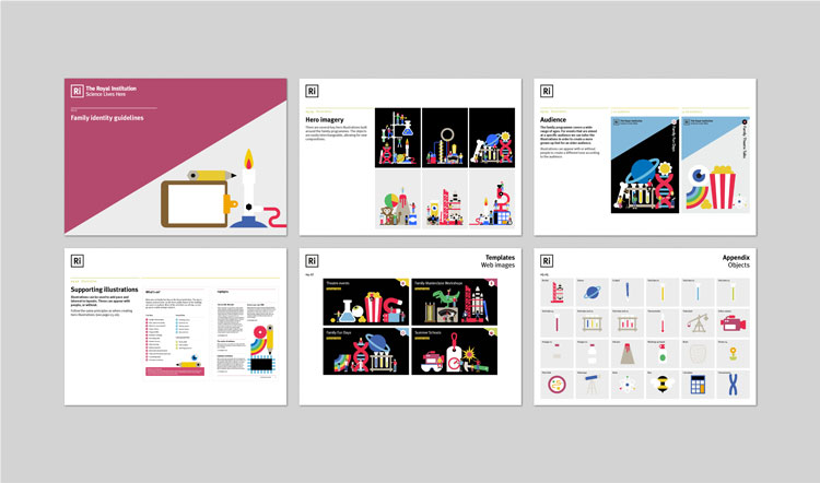
“Immersive science”
Based on the theme of “immersive science”, it features a suite of more than 200 illustrated icons depicting families and brightly coloured, scientific symbols such as planets and Bunsen burners.
There are 75 individual illustrations of people that be adapted depending on the audience, which ranges from children at Key Stage One level to parents.
“As a charitable organisation, it was important that the identity was scalable, allowing the in-house team to expand and build on the identity once we handed everything over,” says Skinner.
The identity for RI’s family programme will launch as part of its Halloween themed event, and will roll out across digital and physical touchpoints including its website and advertising over the coming months.


Read this next

-
Post a comment


