Aloof Design puts Roberson Wine in the black with distinct premium trade identity
Aloof Design is creating a new website for the premium trade department of independent wine merchant Roberson Wine.
The consultancy began work on the project in September 2010, having previously refreshed Roberson Wine’s retail website.
Aloof was briefed to create a separate identity for the trade arm of the business that would differentiate it from the retail site and outlet in London’s Kensington High Street.
Aloof Web designer James Crossett says, ’Some 80 per cent of the business is from the trade department, but they hadn’t properly represented that online.
’They wanted to create a separate identity for that premium service. It needs a separate Web presence to function in its own right as a separate part of the business.’
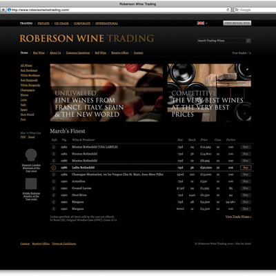
The site will use a ’slick, black’ palette, and retain the current Roberson logo, aiming to reflect the premium nature of the service.
Crossett adds, ’It’s the opposite of the retail offer, which is white – it helps to differentiate trade and retail. The inspiration of the premium service led us down the black and gold, cool, simple route.’
Aloof will also create templates for the client to apply the design in future. It is hoped the site will launch within the next six weeks.

-
Post a comment


