Ragged Edge refreshes Deliciously Ella branding
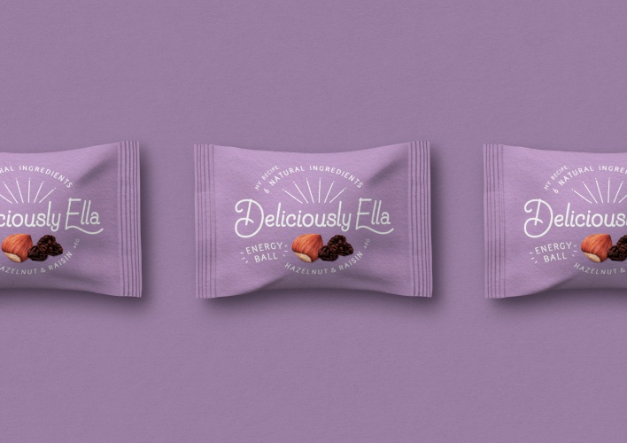
The consultancy has also designed the packaging for the food blogger’s first retail product, Deliciously Ella Energy Balls.
Ragged Edge has redesigned the visual identity for food blogger Ella Mills, commonly known as Deliciously Ella.
The rebrand includes a new design system and updated logo – shared with health food restaurant Mae Deli, co-founded by Mills and her husband – as well as the packaging for the blogger’s first retail product, Deliciously Ella’s Energy Balls.
“Reinforce personal connection with her followers”
Based on Mills’ own signature, the logo features a hand drawn typeface and a “sunburst” shape that seeks to “reinforce her personal connection with her followers”, according to Ragged Edge.
The consultancy chose a hand drawn typeface – Naive Line Sans – for headlines and the monospaced Elementa Regular for body copy. Ragged Edge cofounder Max Ottignon says: “Used together, these feel approachable, warm and human.”
“Natural, simple and honest”
Meanwhile, the packaging for the energy balls has been designed to reflect Mills’ three core values: “natural, simple and honest”. It combines bright colours – designed to make it stand out on the shelf compared to other similar products – and comes in a matte texture.
Ottignon says: “Much of Ella’s popularity stems from her open and honest relationship with her followers. Maintaining that level of trust as her brand grows into new areas was crucial.”
“Our strategy set out to build on her core values and create a beautifully crafted design, with substance and weight.”
The Deliciously Ella Energy Balls launched at Whole Foods this month and will also be rolled out to selected supermarkets.


Read this next

-
Post a comment


