Glazer puts Mind logo in the frame
Mental health charity Mind retires its iconic, but ‘too Christian’ dove logo this week, in favour of a more inclusive marque, created by Glazer, as part of a £120 000 corporate identity brief.
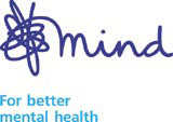
The group was appointed to the project two years ago on the back of a four-way creative and credentials pitch. A Glazer-designed style guide is to be distributed to the charity’s 210 Local Mind Associations and 110 shops, and a strapline – ‘For better mental health’ – created in-house with Glazer’s assistance – has also been introduced.
According to Mind director of fundraising and communications Ruth Evans, the change will result in more uniform use of the identity across Mind’s numerous affiliate organisations and dispel confusion.
‘A lack of consistent application of the main brand meant a significant percentage of the general public weren’t aware that Mind was behind all those different interpretations,’ says Evans.
The previous logo, in use since the 1970s, though refreshed in the mid-1990s, featured a dove swooping over the charity’s name. Research suggested it failed to appeal to a diverse audience. The refreshed look sees the word ‘mind’ emerging in cursive form from a scribble.
‘The dove wasn’t relevant enough to keep,’ says Glazer consultant Edward Tyler. ‘Mind has a pan-cultural audience and the dove was seen as being a bit Christian, a bit Old Testament.’
The new marque is deliberately abstract to appeal across the board and demonstrates the calm that can come out of the confusion of mental health issues, adds Tyler.
-
Post a comment


