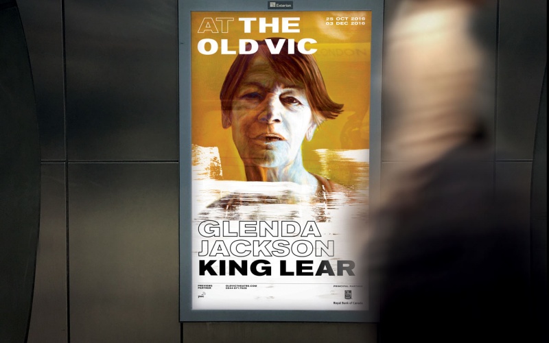
Pentagram’s Harry Pearce rebrands The Old Vic theatre
The design for the London theatre takes inspiration from the wall-painted typographic style found on many of the city’s historic buildings.

Pentagram partner Harry Pearce has designed a new visual identity for The Old Vic theatre in London, basing the design on its pub-like moniker rather than its original name, The Royal Victoria Theatre.
Designed to be “raw” and “honest”, Pearce says the visual identity is inspired by spirit of what the theatre is all about: “connecting with people”.
During the design process, Pearce spent time with The Old Vic’s artistic director, Matthew Warchus, learning about his vision for the theatre, as well as looking through the extensive physical archive of graphic material relating to the theatre.
Akzidenz Grotesk Bold
The end result sees Akzidenz Grotesk Bold Extended – a typeface which dates back to the late 19th century – applied to the theatre’s specific show and seasonal posters through a prescribed grid and typographic system.
“The play and the place are woven together,” says Pearce. “The logotype is written so it is like the rest of the text on the poster, not a separate marque.”
Pearce’s choice of typeface was inspired by the wall-painted typographic style historically found on pubs and other buildings in London, as a nod to the colloquial name of the theatre.
Changing colour schemes
The typographic system accommodates for a range of different colour combinations, depending on the type of event being publicised.
“It’s a very simple system but it changes constantly,” says Pearce. “It has to be open because the kind of stuff that goes on there ranges from comedy to tragedy. It is so varied that the identity has to swallow up all of those differences.”
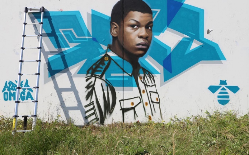
Street artists were commissioned to create illustrations for the posters to give them a raw, unpolished look, and Pearce has taken a series of behind-the-scenes photographs which are being used on the theatre’s website and non-show collateral.


Lokks a bit Neville Brody c.1988. Not sure if that’s intentionally retro or just a bit dated.
Can’t put my finger on it…but not sure I like it. Doesn’t seem very clever/smart/elegant… just bit “shouty”. The type becomes noise as opposed to being legible. Just feels uncomfortable from a design perspective. Design over function.
so ugly. a step backwards for the old vic
This is awful. The previous work was WAY better. How the mighty have fallen at Pentagram — there used to be ideas as the basis for their work. Now… this…