Design Bridge gets its teeth into Wisdom
Design Bridge has redesigned the packaging for toothbrush brand Wisdom which will appear in store later this month.
Wisdom’s identity incorporates a ‘smile’ graphic device, which is reflected in on-pack photography of smiling people and a cut-out smile revealing the toothbrush.
The identity will remain unchanged, but the ‘smile’ will cease to be used on all other material, a Design Bridge spokeswoman says.
The revamp reflects a change in the way the Wisdom brand wants to be perceived. ‘The smile iconography had started to look dated. Wisdom now wants to focus on technical innovation and effectiveness rather than the feelgood factor,’ she adds.
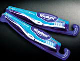
The consultancy has introduced a 3D, embossed ‘brand tag’, designed to lend the range strong branding and make the toothbrush more visible.
In cross-section, the packs borrow from aircraft styling to give the impression of ‘streamlined, high-tech performance’, according to the spokeswoman. Colour-coding has been introduced to help consumers choose the correct toothbrush.
Design Bridge won the project on the strength of its earlier redesign of the Wisdom identity and packaging in 1999 (DW 15 Jan 1999). It did not have to pitch for the work.
Structural as well as graphic packaging design work has been undertaken by Design Bridge with new product lines developed in-house by Wisdom.
-
Post a comment


