Close ranks
A rigid formula dictates the design of women’s magazines, and yet a small change to this template can produce a boost in sales. So why, asks Trish Lorenz, do all the leading titles still look the same?
In the 1960s and early 1970s, women’s magazines redefined their vision of femininity, with titles such as Nova featuring both challenging editorial and world class graphic design. But recently the glossies, particularly women’s interest, have lost a little of their shine.
In every newsagent, row after row of magazines, their covers featuring the same celebrity, peer down from the racks like a line of schoolgirls, indistinguishable in their uniformity. Yet the sector is awash with design revamps. Cosmopolitan is about to go under the knife, following Elle and Marie Claire. But is it major surgery or a simple nip and tuck?
Many observers suggest the latter. John Brown Citrus Publishing creative director Jeremy Leslie, who was behind Virgin Atlantic’s award-winning and mould-breaking in-flight magazine Carlos, points to the stir that the launch of pocket-sized bombshell Glamour created, as evidence of a lack of real design development across the sector.
‘When it’s big news that someone has produced something smaller, it highlights in the broader context how little diversity the market has seen,’ he says.
Leslie believes design hasn’t evolved in any real way since the 1970s. ‘There’s a perceived way glossies should look,’ he maintains. ‘All these magazines have the same, clichéd way of presenting themselves. All the front covers are the same. It’s formulaic and very repetitive.’
Cosmopolitan, one of the biggest brands in women’s magazines, this month appointed Andy Greenhouse as art director. He joins from Company, where his work in updating the magazine’s look is credited with helping achieve ‘the title’s highest ever circulation’ under its then editor Sam Baker.
Greenhouse concedes there are ‘formulaic’ elements to women’s magazine design – at Company the cover prescription involved a thigh-high crop of the cover model, cover lines and the white masthead – but he says Cosmo ‘needs a big shake up’.
‘When Cosmo launched, it led the way and I want to get back to its real strengths, not compete so much and play up the confidence of [the brand],’ he says. ‘I want everything to reflect a more indulgent feel. The challenge is to update the design while maintaining its energy.’
Greenhouse is working on a redesign of the January issue. He says British Cosmo currently has few parallels with its American counterpart and he aims to bring them closer together.
‘American design has more confidence , it feels more mature than the UK,’ he explains. He is aiming to ‘strip down’ the design by re-evaluating typography, toning down colours and taking a considered approach to photography.
Yet, confirming Leslie’s comments about the market’s conservatism, Greenhouse also concedes that ‘Cosmo is an iconic, global brand and you can’t mess with it too much’.
He admits that he is seeking a redesign that will convince the reader that ‘they are getting a better product’, but without identifying the cause. The masthead will remain untouched and the cover formula is unlikely to change.
‘The reader shouldn’t think, “That’s weird or different”, I want them thinking it is cooler, without really knowing why,’ Greenhouse explains.
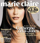
It’s a view echoed by Marie Claire creative director Stuart Selner. The magazine launched a revamped issue last month. It’s now American A4, slightly smaller than the British equivalent, and Selner has ‘softened the graphics a bit and made it more sophisticated and glamorous’. However, he says there was ‘absolutely no thought of doing something more radical’.
‘The market is far too conservative, it’s never going to happen,’ he asserts. ‘Magazines are like a friend to regular readers. If you do something different, throw things up in the air, it’s a huge gamble.’
It’s this lack of desire to challenge the reader that appears to be the problem. Would readers really be turned off by a magazine redesign that dared to be bolder?
Greenhouse argues there is evidence to believe they would. ‘If you present something in a way the market isn’t used to, you will alienate [readers],’ he maintains. He points to the now defunct Jack magazine, which experimented with illustrated covers.
‘[Jack was] great from a design point of view, but I don’t think loads of guys bought it instead of GQ because of that,’ he says.
Selner is more ambivalent. ‘There are too many magazines and not much originality. We’ve lost the sexiness and bravery that [designers like] Neville Brody had.’
But he is also pragmatic. ‘We’re as creative as possible within the constraints,’ he adds. ‘Editors and art directors would like to break the cycle, but it’s a publishing decision at the end of the day. Our business is all about money.’
Leslie agrees this is the case. ‘The [women’s] market is so cut-throat that there’s little space for experimentation or bravery,’ he says.
But an aversion to breaking the formula is not solely the domain of women’s glossies. The editorial design component of the Barbican’s Communicate exhibition highlights just how much the entire market has changed.
Compare Pearce Marchbank’s iconic green cover for Time Out in the 1970s (DW 16 September), featuring nothing more than a handful of tiny words reversed-out of a green background, to the bland, celebrity-led covers the publication favours today.
It appears that when cash and creativity meet head to head, imagination is sometimes sacrificed at the altar of commercial success. But it’s difficult to believe the two have become mutually exclusive.
Glamour’s handbag-sized version, seen as a radical move by the sector, has seen it move to the top of those all important Audit Bureau of Circulation figures. Perhaps it’s time for art directors and editors to sell the merits of an alternative creative vision a little harder.
Read this next

-
Post a comment


