D Studio cooks up new fudge packaging
D Studio has created new packaging and on-pack graphics for fudge company Burnt Sugar, aiming to celebrate the product’s ‘irregular pieces of taste bud-tingling randomness’.
The consultancy began working on the project in April 2011, due to an existing relationship with the client. D Studio creative partner Wes Anson has previously worked on gift boxes for Burnt Sugar, and the consultancy was appointed to the rebrand project without a pitch.
The project saw D Studio work on tone of voice, on-pack graphics and structural elements, changing the packaging to open at the front rather than the reverse.
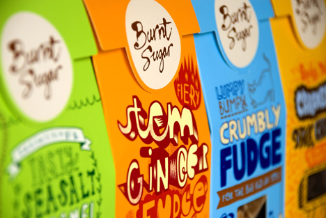
The consultancy retained the current logo, and commissioned five different illustrators to create designs for teach of the products in the range, aiming to emphasise the idea of individuality.
Anson says, ‘The key brand essence is that everyone’s different, so there’s the idea of diversity and celebrating individuality. We used up-and-coming British illustrators working in five very different illustrative styles.’
He adds that all the illustrations had to embody the brand idea of being ‘young at heart’, using a bright colour palette. No single font was used, with every element including statutory pack information hand-rendered.
D Studio also modified Burnt Sugar’s website design, and created some point of sale elements. The new packaging launches in Waitrose from next week.
Read this next

-
Post a comment


