Volvo updates its identity
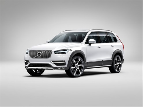
Volvo has updated its identity with the launch of its new XC90 vehicle.

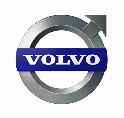
The updated ‘ironmark’ logo has been created by Swedish consultancy Stockholm Design Lab. The logo has been in use since 1927 and is based on the chemical symbol for iron.
The consultancy says, ‘Volvo needed an update of the ironmark, optimised for communication and versatile for all types of applications.

‘The symbol has been simplified in its purest form and conveys the vision to be the world’s most progressive and desirable premium car brand.’
Volvo says, ‘The new XC90 will be the first of our cars to carry the company’s new more prominent iron mark, which has the iconic arrow elegantly aligned with the diagonal slash across the grille.

‘Together with the T-shaped “Thor’s Hammer” DRL lights, the iron mark introduces an entirely new, distinctive and confident face for Volvo’s forthcoming generation of cars.’
The previous iteration of the ironmark was created by Bite in 2006.


I don’t like it. It looks too much like the symbol for ‘male’ / man
Is this for real? Are they trying to attract or repulse female customers? The designers sometimes can get it soooo wrong….
It’s always been shaped like that.
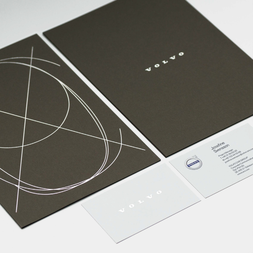
More importantly, the word mark is now smaller in the identity – with the brand name less visible on the vehicle and collateral. hoe can this be a good thing?