Johnson Banks overhauls Brighton Dome and Festival Brands
Johnson Banks has overhauled the Brighton Dome and Brighton Festival brands, and designed the campaign and brochure for this year’s Brighton Festival, which is being guest directed by children’s laureate Michael Rosen.
This year’s Brighton Festival look, which will be unveiled in the City today, is underpinned by new Brighton Dome and Festival branding created by the consultancy.
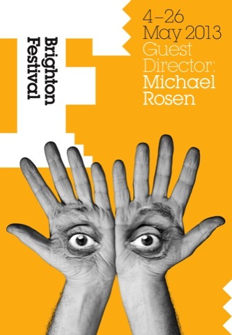
The main brochure and campaign image features Rosen’s hands and eyes, but set in a way that directly references German artist Herbert Bayer’s 1932 work The Lonely Metropolitan.
Johnson Banks creative director Michael Johnson says, ‘Although being primarily known as a poet and writer, Michael Rosen has a deep interest in all things Bauhaus. Therefore we were inspired by Herbert Bayer’s 1932 photomontage of eyes in the palms of hands, The Lonely Metropolitan, when creating this image.
We also wanted the image to echo an open book and comment on the sensory experience of the Festival,’ says Johnson.
Through the festival programme, which is announced later today, Rosen will explore ideas including openness, learning, German culture, story, language, memory and loss.
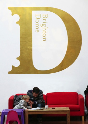
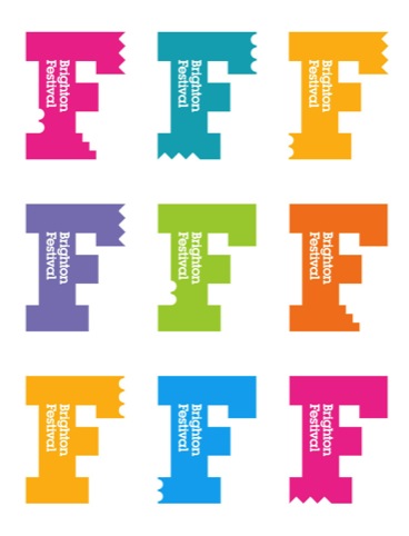
In the same way that Johnson Banks has anchored the Brighton Dome branding with a letter D, the Festival branding is anchored with a letter F.
Johnson says, ‘The edges [of the F] contain geometric patterns, which vary to symbolise different elements of the festival, hinting at steps up to a performance space, celebratory bunting, the architectural elements of Brighton Dome itself (a key festival venue), and the fact Brighton is a city literally and figuratively on the edge.’
The Brighton Dome organisation’s brand is still being applied. The building is situated within the Royal Pavilion estate where signage and wayfinidng is rolling out to achieve a consistent message with print and online around the proposition ‘inspire creativity and enrich lives.’
They.Create has designed the festival website, which has full details of the programming and incorporates the new branding.
Read this next

-
Post a comment


