Caffeinated rebrand or misplaced froth?
After the dust has settled on the recent Starbucks rebrand, guest blogger Simon Manchipp, co-founder of Someone, gives a lengthy analysis of the move and argues that Starbucks may have missed a trick.
People outside of marketing and design, people who don’t know about serifs and Pantone numbers, don’t really care about logos.
In fact, to Mr and Mrs Smith, the logo is dead. They are not that useful, not that interesting, too expensive and often not a good sign. Why rebrand if everything is ok?
A logo change is often met with disdain and relaunches that rely too heavily on a new logo generally raise more questions than answers — or just push conversation in the wrong direction,
I’m not saying there’s no space for a new logo when a business is changing, not at all. It is sometimes a vital part of clearly ringing the changes. But to rely on just a logo to do complex communications is madness.
When it comes to clearly stating new business strategies, objectives and changes, a new logo is often the wrong thing to focus on all together. Rebrands don’t always need new logos — they need new thinking (As the Victoria & Albert Museum re-fresh so eloquently demonstrated).
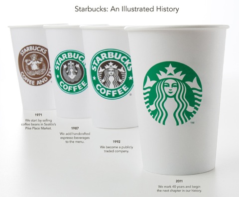
So, Starbucks – the world’s largest chain of coffee shops – has a new version of its logo applied in a minimalist way to stuff. They have dropped the word Coffee from the logo and look like, in time, they may drop the name Starbucks on some applications.
So why do this rebrand? Starbucks chief executive Howard Schultz said, ‘The logo […] is a mirror image of the strategy.’
There we go then. These changes are definitely not just aesthetic, they are strategic in their purpose. The rebrand is there to support new thinking. That thinking being: we don’t just do coffee anymore.

Yet the emphasis in the ‘preview’ press release and dedicated website is still on the logo.
Even though the logo comes from the strategy, people (including naughty Howard) are banging on about the look of the symbol. Now, I’m sure he’s proud of it, as we all know, creating a new logo for a big company is tough, long and emotional. So it’s no wonder that when the thing is finally agreed ready to be revealed, Howard and co want to make a song and dance about it. But it’s a mistake.
Strategically, the reasoning behind dropping the word ‘coffee’ is spot on – they now sell ice cream, beer and probably other stuff – but they want to brand products with something that does not say coffee. Fair enough, I’ve tried Coffee Beer and I didn’t like it either.
But, a cropped version of the old logo does little to tell people of the new plans Starbucks has. People understandably get stuck on the new symbol. Here, the logo is a dead weight around the communications neck rather than a ‘dead cert’ to get the right message across.
This rebrand struggles to really get people talking about the real changes afoot at the organisation. It’s not Gap-gate, but we can learn from this to get brands better at talking to people about what’s going on, why it’s good news and who’s going to benefit from it.
To effectively re-launch a brand these days, particularly a globally established one like Starbucks, the logo is not the problem.
And it’s certainly not the hero.
The traditional consultancy’s knee-jerk pull towards the creation of a new logo is misplaced. It’s foolish to re-launch with a new logo at the helm of brand communications.
At Someone we always recommend to lead with demonstrable change, and support these changes with branding, not the other way round. If we stopped blinkeredly worrying about logos and started looking at the bigger picture we’d realise that logos are only a tiny part of the creative opportunities open to branding now.
Pictograms, signage, typeface design, colour systems, photography, illustration, installations, interior design, packaging, music, film, animation, fashion, sculpture – it’s all out there waiting to be created for brands.
Sure, re-create the symbol, get it perfect. Change it completely if you think it’s irretrievably polluted with bad connotations. Crop it, craft it, make it delicious. Whatever supports the strategic thinking behind change.
But then design a world in which it can live to more richly tell the story of change and the story of the brand. Not just (as has happened here) relentlessly and monotonously badge everything in sight like a logo-maniac with a new rubber stamp.
Simon Manchipp is co-founder of London design consultancy Someone.
Read this next


I agree that the logo is definitely not the be all and end all and that real strategy should start with the business and brand elements reflecting the overall change. However, I’m not too sure if I agree that they got it wrong or that its anywhere close to gap-gate. One of the key issues with rebranding is the evolutionary or the revolutionary scenario. Starbucks are evolving and spreading out into neighbouring territories, not necessarily revolutionising their business completely. To lose all elements of the original logo would confuse and alienate loyal customers which would have a negative effect on the brand. I think they have found a balance between the old and the new.
Interesting article, what’s with the huge picture of yourself!
There is a simple solution which is staring me in the face. Fair enough drop the word ‘Coffee’ but why drop STARBUCKS? Seems shortsighted.
I’m just impressed with the size of Simon Manchipps photo….!±!
“At Someone we always recommend to lead with demonstrable change, and support these changes with branding, not the other way round.”
I’m afraid the author may have missed the ‘demonstrable’ changes Starbucks has made since 2008, and it is now “supporting these changes with branding”.
Read paragraphs 3 and 4 under Stock Analysis for the evidence.
http://www.investorguide.com/article/6268/return-of-ceo-schultz-results-in-dividend-for-starbucks-shareholders-sbux/
Agree with gem r. I wouldn’t say they’ve got it wrong or missed a trick with this rebrand. It’s an evolution that reflects how Starbucks business is evolving. Sure a new logo isn’t going to make their coffee taste better, but who said they’re not working on that?
I posted my simple fix on mywebsite: http://www.jspindesign.com/pet-the-nips/
I actually like the simplicity of the logo. A brave move to drop the Starbucks name but all depends on the rest of the brand application, how the shop fascia carries it etc. It is more espresso than late… A good thing!
Great article. I had a very similar take on my blog at sozopivotal.com. I love the new logo, but wonder about the strategy that it’s been paired with.
John B —
Hi there, I don’t think I’ve missed that they have had a great deal of change…
Yep, I’ve seen that report too.
Thing is, while shares are up an impressive 35% this is largely attributed to closing shops (over 900 of them) and Howard even took a pay-cut…
After two years of cost cutting they plan growth… and chose to start this growth by launching a… err… new logo?
That seems a bit daft…
I guess what I should have said is a good rebrand leads with POSITIVE demonstrable change… good stuff that people benefit from, and have the branding surround, support and help communicate the good news.
Great to see the debate continue here!
That logo is awful. Just showed my colleagues (we are all graphic designers) and they were appalled. I wonder how much the designer got paid to ‘come up’ with that??
Anna — another reason why logo’s are a bad thing to launch with… No one likes the cost associated with them…