New 4G broadband company Relish branded by Turquoise
Turquoise Branding has created an identity system for 4G broadband company Relish which focuses on the capacity rather than speed of the service.
The consultancy has developed the name, brand strategy and identity of Relish, which is a new 4G network for London.
Relish has been set up by UK Broadband, which owns the biggest proportion of the 4G data network.
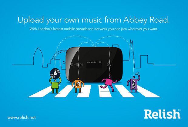
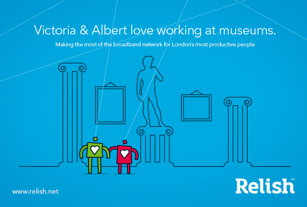
Turquoise Branding creative director Gareth Mapp says the identity, ‘sidesteps the emphasis on speed that other broadband providers focus on and instead throws a spotlight on the daily needs of high-volume data users in the capital – characterised by the colourful “London’s Productive People” seen throughout the visual identity.’
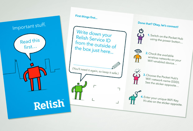
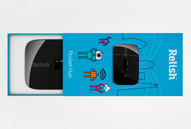
Characters drawn by illustrator Priya Mistry have been integrated to drive the core message of fibre-fast broadband without the need for wires according to Mapp who says, ‘By developing a set of characters as an integral part of the brand identity, it allowed us to focus on the user benefits of the product instead of the speed.’
Mapp describes Relish as a ‘plug and play’ service with ‘no need for engineers’ and says the branding reflects that it is ‘easy to use’ and is targeted particularly toward ‘small businesses and people who live in flats.’
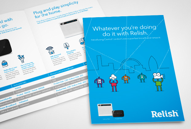
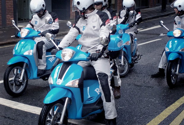
The designs have been applied to packaging, campaign work and above and below the line activity including pizza delivery-style bikes which will deliver the modem to buyers. A website www.relish.net has been designed by Think.
Read this next

-
Post a comment


