Wildlife charity takes illustrated approach for rebrand
Colourful has created a new identity for conservation charity People’s Trust for Endangered Species, which is based around the use of illustrations.
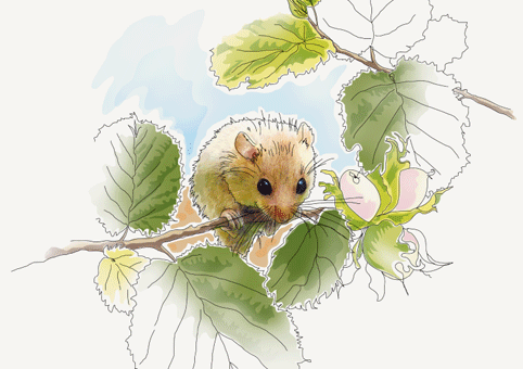
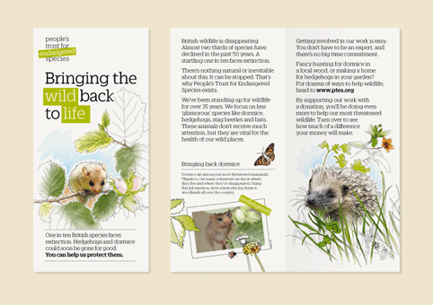
Phillip Southgate, associate designer at Colourful, says, ‘All wildlife charities use lots of photography. We wanted the brand to stand out by using illustration.
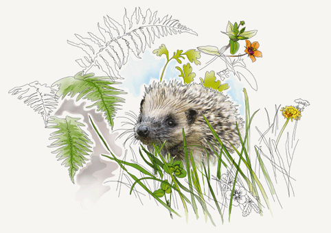
‘Our approach shows colour draining from or re-entering the environment, and the core look is very British to differentiate it from international conservation charities.’
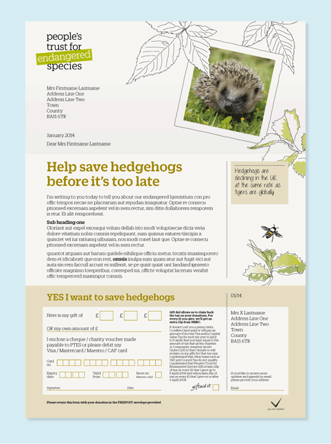
Southgate adds, ‘We’ve created hand-drawn frames for photographic content to make them distinctive. It’s a style that will help the charity to be much more recognisable.’
Colourful says the strength of PTES is in joining up scientific research with real action on the ground, but that the charity needed to present a friendlier and more recognisable brand to supporters.
The consultancy developed branding around the strapline ‘Bringing the wild back to life’, which carries through into illustration.
Within the logo, a green banner holds the word ‘endangered’ and this is re-purposed as a device in campaigns.
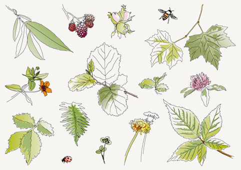
Colourful has also created a toolkit of illustrative elements and graphic devices to work across a range of publications and event materials.
Illustrations were created by Colourful associate Hayley Cove. Tone of voice guidelines and top-level messaging were developed by Reed Words. The website was created by Mike Leach and James Burden.
Colourful won the project following a credentials pitch in December 2013.
Read this next

-
Post a comment


