Notes from Russia
Branding a city or country can be a particularly tricky challenge, especially when it’s an area with a name as catchy as Nenets Autonomous Region.
The Russian region has been given a charming new look by Russian consultancy Notamedia, centred around the similarly snappy tagline ‘Nenets Autonomous Region is the North European pantry of Russia’.
Although ‘pantry’ might have got a little lost in translation – images of scullery maids, Women’s Institute jam and Mrs Beeton recipes probably wasn’t quite what Notamedia was going for – the thinking behind the new identity is all about the copious reserves and mineral resources enjoyed by the area.
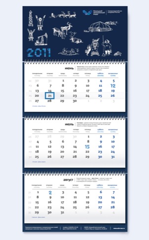
What’s so captivating about NAR’s new identity is the vast amount of relevant local meaning that has been bestowed on quite a simply logotype.
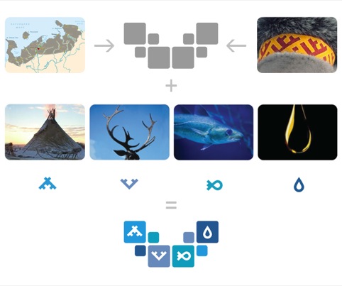
The identity consists of a series of building blocks, some adorned with icons inspired by folk ornaments. The tent icon references traditional structures from the region and is a marker of how important welfare is in NAR. The antlers symbolise reindeer breeding, the fish shows fishing, and the teardrop icon represents the crude oil production in the area.

Notamedia has formed the building blocks into a curved shape which roughly resembles the arc of the region.
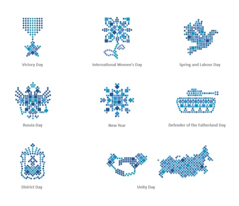
The consultancy has furthered the building block idea to create branded icons for a number of Russian national holidays, such as Unity day and Soviet hangoverholiday, the wonderfully named Defender of the Fatherland Day.
It’s a distinctive, recognisable and flexible identity, with lots of local quirk and significance. And although Nenets Autonomous Region might not trip off the tongue, its visual language has plenty of hooks.

Read this next


‘Defender of the Fatherland Day’ ? Very weird translation. The holiday is officially named The Day of the Soviet Army.
Hi SEan,
Had lunch with Su yesterday & she told me how well Madelaine Design is doing – I’m really pleased for you! Thought this article would interest you.
Best Regards,
Jean