Holmes & Marchant rebrands Farrow & Ball
Holmes & Marchant has created an updated identity for paint and wallpaper company Farrow & Ball.
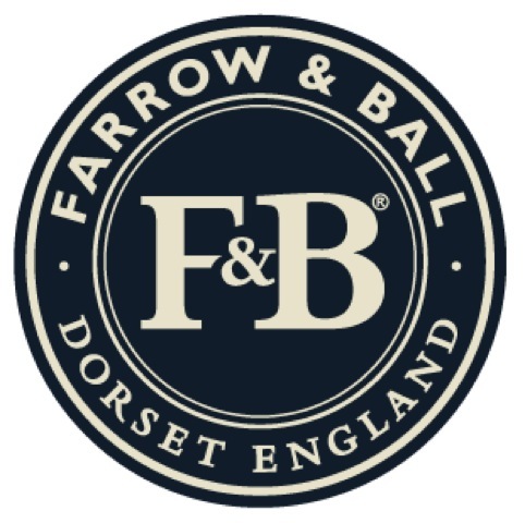
The updated roundel logo uses the company’s ‘Railings’ and ‘White Tie’ colours, alongside Bembo and Gill Sans typefaces.
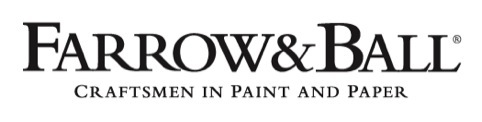
The single-line version of the identity has also been updated, to include the strapline ‘craftsmen in paint and paper’.
Farrow & Ball says it was looking to develop its identity as part of an international expansion. Sarah Cole, marketing director at Farrow & Ball, says, ‘We wanted to ensure all consumer-facing Farrow & Ball identities were consistent as we expand the brand overseas.’
Greg Vallance, creative director at Holmes & Marchant, says, ‘Farrow & Ball is an inherently classic, British brand so it was vital we found the balance between respecting this cherished heritage and updating an identity in keeping with Farrow & Ball’s global expansion plans.’
A spokeswomen for Holmes & Marchant says the consultancy is also working on packaging and other designs, which will be unveiled soon.
Read this next


Personally I feel that the letter spacing throughout the Farrow & Ball single line signature to be absolutely atrocious. I was always taught to look at the negative spaces as much as the positive – where is the balance and any elegance? The W, ampersand and B are also a disaster. IMO of course.
looks uNevEn and far toO conSidereD
For a brand synonmous with british quirkiness, of all the typefaces bembo is surely the perfect match! Funny descenders, sharp and soft serifs.
Too considered? Quite the opposite. Design generally needs less polish more spit!
HORRIBLE! Its really bad typography! It looks too cramped and looks like its been tracked to an inch of its life and the leading caps are far too big!
Sad to see H&M of all companies dropping the ball (no pun intended) like this.
Hmmm. looks like only the roundel was redesigned (much better) and the long line has a new copy line (craftsmen sounds better than manufacturers). unless my eyes are deceiving me?
The last comment is correct…Farrow & Ball logo is as it’s always been…quirky but traditional. The copy line underneath was designed to sit with it. Should have shown a before and after of just the roundel to clarify any confusion!
‘We wanted to ensure all consumer-facing Farrow & Ball identities were consistent’ How are the two versions of Logo consistent? each one has different typefaces! Pointless ‘redesign’.