Lippincott designs new eBay identity
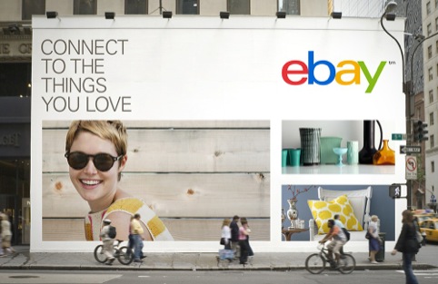
eBay’s in-house designers have worked with US based consultancy Lippincott on branding which positions the company as a ‘global online marketplace’ rather than an ‘auction-style listings’ site.

The new identity marks the first redesign in the company’s seventeen year history.
Lippincott senior partner Su Mathews says, ‘We wanted to reflect the right amount of change in eBay’s new logo. The design is inspired by today’s vibrant marketplace and sleeker experiences.

‘We leveraged the iconic colour arrangement and approachable form to reflect eBay’s heritage and evolved it with a brighter blue and darker yellow, and a streamlined arrangement to create more visual harmony.’
The new brand and refreshed website will reflect ‘a global online market place that offers a cleaner, more contemporary and consistent experience,’ according to eBay.

eBay says, ‘We retained core elements of our logo, including our iconic color palette. Our vibrant eBay colors and touching letters represent our connected and diverse eBay community.’
The brand has been positioned to reflect eBay’s evolution from selling second hand, vintage and specialist items to also selling new items.

‘eBay will become more personalised, tailored to the way you want to shop. We will be local and global,’ according to eBay which wants to ‘create better ways to buy and sell.’ To this end the new branding ‘reflects a dynamic future’ eBay says.


How Much did ebay pay Lippincott to re-design their logo?
I personally think it’s much better… from PLAY SCHOOL > to > DESIGN SCHOOL 🙂
I hear and understand what the man says, but really and truly what they’ve done is create a safer, more corporate and less interesting identity…which probably is a fair reflection of the business itself
Can we thicken those letters up a bit please, it’s looking a bit weedy. No, not as much as they were. Yes, that’s right – outline the stroke and voila. Great. Pdf it and let’s get it over to them and let’s get down toe TGI’s. Whew and other week over.
A new brand identity for ebay was never going to be a branding revelation, but this really is an incredibly boring solution. Where is the message to convey how exciting using ebay could be? Where is the allusion to the company’s dominance in digital shopping? Indeed, where are any of ebay’s attributes within this piece of work?
In my opinion this is an opportunity lost for ebay to show itself as a company proud of what it does and one that is at the figurehead of a rapidly changing shopping environment.
I prefer the old identity. Its lost its individuality 🙁
So everyone calls it eBay and the identity is ebay -that’s annoying. Old logo had more energy…
So easy to criticise,but anyone here read the design brief? If this new logo persuades millions of shoppers that it’s safe to spend millions of dollars on ebay, then it’s worth a cut of those millions. End of story.
Lippincott do a lot of great work, I’m hoping the rebrand goes deeper than this fairly underwhelming refresh. Full thoughts here: http://www.helloimdavid.com/blog/2012/09/ebay-gets-a-new-logo-missed-opportunity/
Typically American! – boring, corporate and safe!
I’d like to see the logos which got away.
I think the type looks awkward where it just kisses the next letter, if they were going to be touching surely they could do so in a more natural, fluid way?
If first year design students had presented this logo any lecturer or experienced designer would tell them to ‘go away and come back with something more memorable/interesting/original…
Am I missing something? All that has been done is take away the very, very, very well known and instantly recognisable logo and replace it with 4 bog standard letters…….. Perhaps I don’t understand art?!
yes it may be neater, but the website itself needs streamlining. its a better user experience now than when i first used it a few years ago, but still feels like its a drawn out process, escialoy when you want to list loads of items. it becomes a chore.
looks like an undergraduate mock-up, done the night before the exam in a rush. So cheap.
A good days work all in all… Univers 53 extended, 1/2 a point of outlining and a bit of judicious kerning.
I think it’s a much cleaner and more business like logo but it does lack any personality and energy.
Personally I would have brought in an uppercase B, just to give it a bit of energy. ( I mocked it up here: http://dribbble.com/shots/728582-eBay-With-uppercase-B
It will be interesting to see it in execution, the mock ups they used were shocking, some very crude photoshops, the one that baffles me isthe bags? Are they now going to a physical store.
Hopefully the new branding will bring a much cleaner website to.
It’s a shame the new rebrand appears to have lost the very core attribute that made ebay so unique – pure variety!
In my opinion, a highly polished effort, beautifully executed but lacking all of the individual charm of the old identity.
Is it me, or when companies re-brand their logo these days, they tend to go for the lower-case geometric sans-serif typefaces? Have I not mention Waterstones (who went back to their original logo if I am not mistaken), even Microsoft “downed” it to 4 colour blocks. My university UAL did the same thing too – Helvetica lower caps.
Boring.
What happened to creativity! I know people want “the clean look” but it’s all going to look the same…
This is a non-logo.
Consensual, uncreative and “hollow inside. Anything but that “thing” would have been a better choice 🙂
ebay’s CEO has probably made it himself using its text app during a plane trip.
how much did Lippincott charge for this POS?? looks like when i open a file in InDesign and I’m missing fonts lol
Let’s get it out there: this logo which “reflects a dynamic future” is just four letters in a choice of font and colours. I just hope the Agency put forward and argued for some radical & creative designs before eBay (or is it ebay now?) turned them down for this conservative poop. Bet it had the creatives crying into their mocha lattes? Never mind, you got something agreed and the accountants will be pleased.
Read the comments on the ebay discussion forum, and you will see that buyers and sellers do not want the new layout and interface:
http://community.ebay.co.uk/topic/Search-Categories/Ebay-Layout-Changes/1700115530
Read the comments on the ebay discussion forum, and you will see that buyers and sellers do not want the new layout and interface:
http://community.ebay.co.uk/topic/Search-Categories/Ebay-Layout-Changes/1700115530