The Union gives Jura whisky mystic refresh
The Union has created a new look for Jura whisky’s core range, drawing on the landscape and mythology of the Scottish island of Jura.
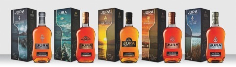
Jura brand owner Whyte & Mackay has worked with The Union on several of its products and approached the consultancy in the hope of better communicating Jura’s flavour profiles and brand values.
The Union designer Graham Hancock art directed photoshoots on the island of Jura to find locations, which could illustrate the names of each flavour profiles.
The symbols, which relate to the myths and legends of the islands, have been redrawn so their size is consistent across the range.

For the two most premium variants, Prophesy and Diurachs’ Own, metallic symbols have been cast on the bottles.
The Prophesy ‘flavour profile’ is linked to the story of ‘a witch who prophesised that the last member of the Campbell clan to leave the island would do so one-eyed, dragging their belongings behind them,’ according to Hancock, who says that details of this mysticism are brought into the tone of voice of the copywriting.
‘It’s the only distillery on the island and I went over with our photographer to capture things like the homes of the islanders for Diurachs’ Own and a sort of lonely pier to show where the clan member might have left from, for Prophesy,’ says Hancock.
The bottle shape has been ‘refined slightly’ and embossing has been made cleaner to make labels stand out more.
On outer packaging the half-bottle silhouette which gives way to photography has been designed so that when placed by the side of another box, ‘it almost creates a mirror image’ says Hancock, who wanted to make the range collectable.
Read this next

-
Post a comment


