Pearson Lloyd’s designs aim to prevent violence in A&E
A Pearson Lloyd-led team has created a series of prototype designs which aim to prevent violence against staff in hospital accident and emergency departments.
The consultancy was appointed to the work earlier this year as part of the £450 000 Reducing Violence and Aggression in A&E by Design project, which is being run by the Design Council and the Department of Health.
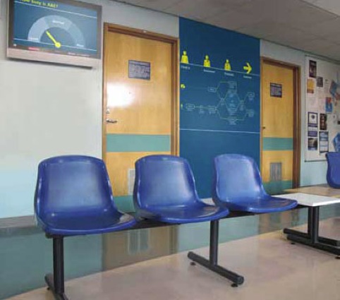
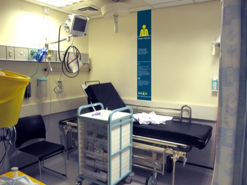
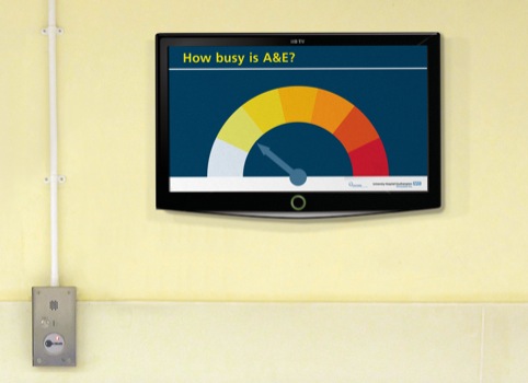
Pearson Lloyd has now led a team to develop a series of designs, which include: a new approach to greeting patients on arrival; a system of environmental signage, called ‘slices’, which gives clear, location-specific information; a personal ‘process map’ explaining what patients can expect from the treatment process; and screens to provide live, dynamic information about how many cases are being handled.
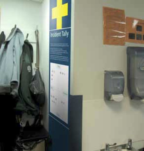
The team, which included the Helen Hamlyn Centre for Design, The Tavistock Consultancy Service and healthcare experts, also created a system of tools to help staff report incidences and share information with colleagues and an eight-week programme to help them work with managers to address incidents.
The designers also developed a toolkit of research and best practice for hospital senior managers.
The systems were developed by studying patient behaviour and interactions with staff, including incidents of aggression. They were designed to be simple to implement across both older and newer hospitals, be low-cost to implement and to avoid creating physical barriers between patients and staff.
Health Minister Simon Burns says, ‘These are practical solutions to help support and reduce the pressure on busy staff – ways in which hospitals can easily redesign the environment according to their budget and how difficult situations can be diffused by simply giving patients more information.’
The designs are now set to be trialled for a year-long period across three hospital trusts: Chesterfield Royal Hospital NHS Foundation Trust, Guy’s and St Thomas’ NHS Foundation Trust and University Hospital Southampton NHS Foundation Trust.
brightcove.createExperiences();
Read this next


I don’t think they take into account that A&E is usually a dirty, disorganised space with many posters, magazines etc Where users or they’re family/friends are in pain. This is when violence and aggression takes place. People are frightened and disorientated. And what you really want when entering is a member of staff to meet you, greet you as a human being and get seen quickly. Giving people a ticket like at the supermarket and a leaflet, might not be the best way to solve the problem.
I agree – it seems pointless to present a solution to this difficult issue with a clean background and karmic music – who is this meant to fool? On first look, my initial reaction is that there’s a hell of a lot of text for patients to read. This would not suit the elderly or those with poor eyesight. That also raises the issue present in many London based hospitals (and I’m sure elsewhere) where multiple languages need to be presented.
The leaflets(without a close look) seem to be a complicated explanation of the system, which has the potential to confuse a lot of people rather than clarify their position. It also looks like a lot of jargon that most ‘complainers’ would take as excuses for why they’re waiting so long.
Once again, another solution that’s presented for people with ‘design heads’ rather than the ‘everyman’. The signage looks like it would become one big blur once it’s all up – with no particular piece standing out. I think colour coding and simplicity may do a better job?
I agree that it’s a big problem – but maybe less crowded and more comfortable seating may help somewhat, along with something as a distraction. When people are hurt (and quite often drunk) this can cause panic, confusion, and an increased degree of self preservation. I think these issues need to be tackled alongside the signage.
It’s fine to see a clear indication of how busy the A&E department is – but I don’t think that will placate someone that has a tendency for violence. (despite how well you present the arrow always pointing to ‘quiet’!)
I’m sure there’s more to this project than meets the eye – but maybe my point is, that in a confusing environment like A&E there shouldn’t be?