Portland works on new St Pancras station signage
Portland is creating a new wayfinding system for London’s St Pancras International Station, working with HS1 Limited to develop new signage and pictograms.
The consultancy initially took an audit of the existing signage and wayfinding to develop the brief for the project, which looks to create a new clearer system without adding ‘visual clutter’ to the station, says Portland.
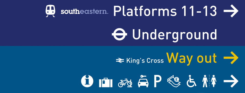
A new colour coding system will be implemented, with dark blue signs for ‘primary’ destinations, denoting rail operators; and light blue for ‘secondary’ destinations such as toilets or cash points.
Christine Dunmore, head of branding at Portland, says, ‘We looked at this project through the eyes of the end user and the variety of routes and journeys within the station to ensure that what we design is 100 per cent user-friendly and intuitive.
‘It was also important for us to understand all the unique requirements of the different train operating companies to deliver a holistic solution that works for all while respecting the iconic Grade 1-listed architecture of this landmark station’.

Source: Clive Darra
White typography in the Din font will be used on the blue signs, replacing the incumbent St Pancras Barlow typeface. The colours of the pictograms have also been changed, and Portland has redrawn a small number of them including the graphic that signals the cash machines.

The new wayfinding will be unveiled in January next year.
-
Post a comment


