No jpegs, no eps – Kent Lyons’ Jarman Awards identity that exists only in 3D
Kent Lyons has created the identity for the Jarman Award, using a tactile, 3D logo that is photographed in a new location for each year of the prize.
The consultancy designed the initial identity for the award in 2009, when it was appointed by film and media agency Film London.
The Jarman Award, which launched in 2008, is given to moving image artists whose ‘risk-taking work resists boundaries and conventional definition – work that encompasses innovation, excellence and vision’, echoing the values of film-maker Derek Jarman, says Film London.
Noel Lyons, Kent Lyons co-founder, says, ‘We focused on creating a visual icon that would become a strong feature of the awards’ identity. We felt that it had to be something that was clearly associated with Jarman’.
The identity is inspired by the later life of Jarman, when he lived near a nuclear power station in Kent coastal town Dungeness, in a black and yellow house on the beach.
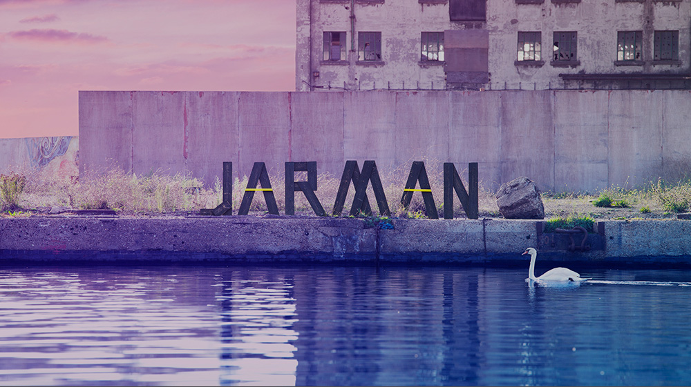
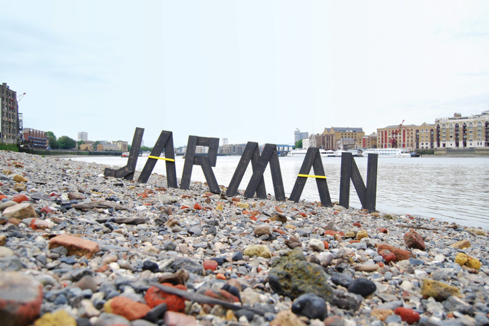
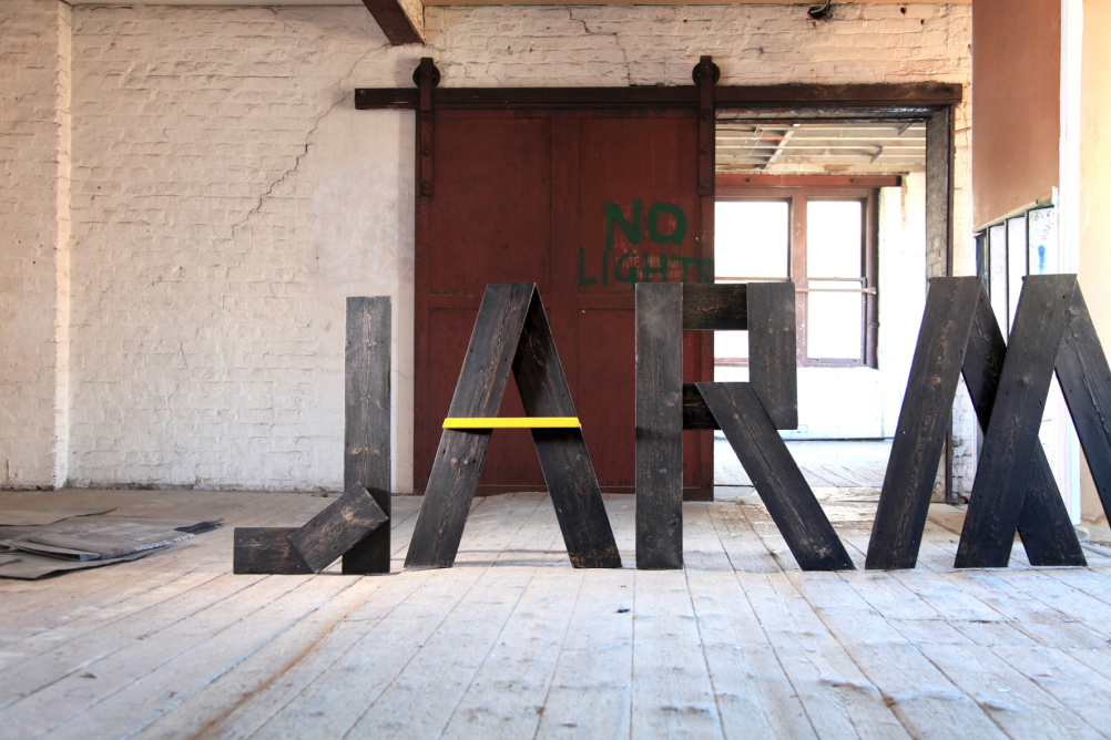
Kent Lyons’ drew on Jarman’s house’s wooden structure’s material to create meter-high letters spelling JARMAN, which were then painted black and yellow.
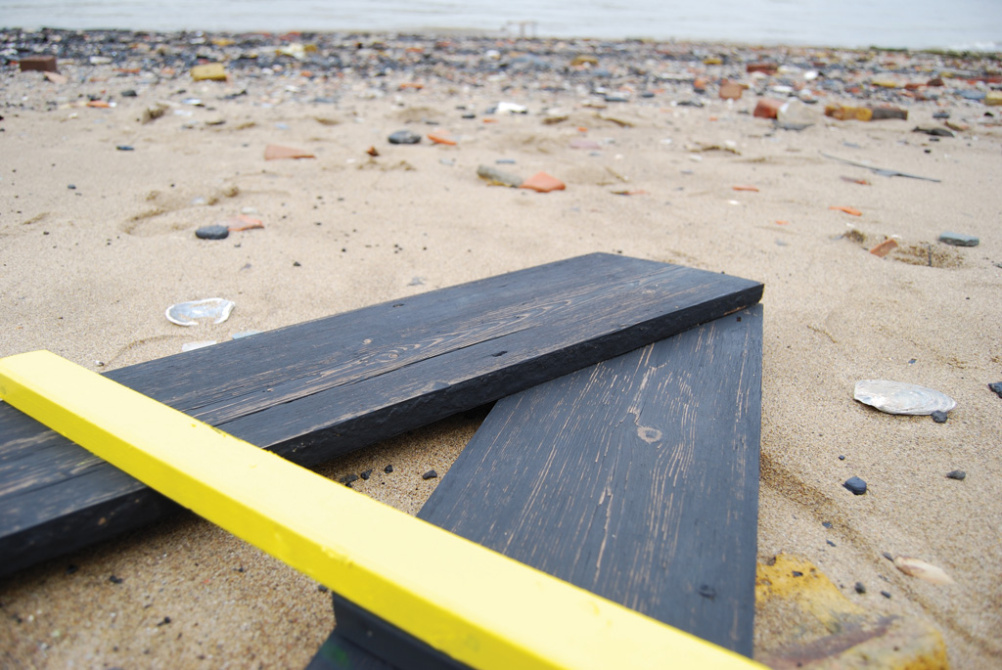
Black cladding for the main stroke width of the type, with yellow beading forming the horizontal bars of the ‘A’ letters.
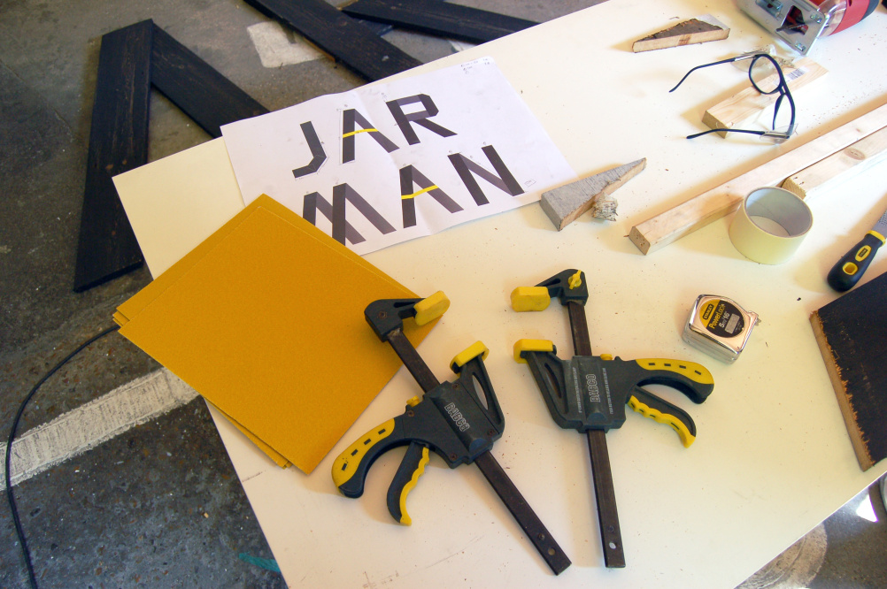
Lyons says, ‘It is a perfect embodiment of Derek Jarman in that it’s an awkward bastard. Awkward, but a beautiful, incredible, arresting object, and an absolute stroke of genius from our creative director Jon Cefai who made it by hand’.
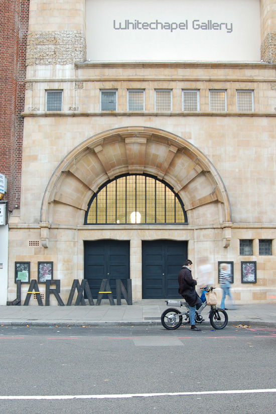
Each year the letters are placed in a different location and photographed to create a new series of campaign images before being moved to the Whitechapel Gallery on the night of the awards. Last year, the shoot took place in the Dungeness site that inspired the look, though every other year it has taken place on the banks of London’s River Thames. This year’s identity is formed from a shoot at London’s Royal Docks.
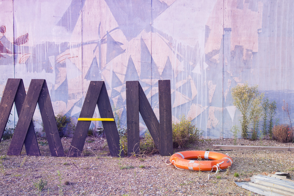
Lyons says, ‘Since 2009 the identity has travelled to a variety of locations, but the real key to the success of the brand is that it is awkward. It only exists in its singular wooden form – there is no eps file, no jpeg.
‘And it’s massive – over a meter high and five meters wide. It lives for most of the year in our studio, taking pride of place on our walls, but comes out once a year to promote the awards.’
This year’s awards take place on 6 November.
Read this next

-
Post a comment


