NB Studio creates “robust” new look for Aspall
NB Studio has created a new look for apple products brand Aspall, designing a new look alongside an assembled team of craftsmen including woodcutters and botanical illustrators.
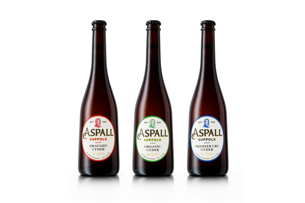
NB Studio has created a new look for apple products brand Aspall, designing a new look alongside an assembled team of craftsmen including woodcutters and botanical illustrators.
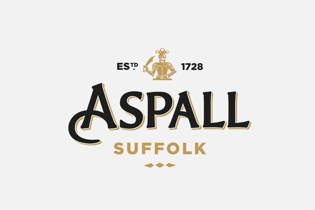
Aspall produces ciders (spelled cyder in its branding), apple juice, vinegar, and other apple-based products.
The new branding looks to reflect the brand’s heritage through a “gently re-crafted yet robust look and feel”, and is used across all touchpoints including packaging, liveries, point-of-sale materials and the website.
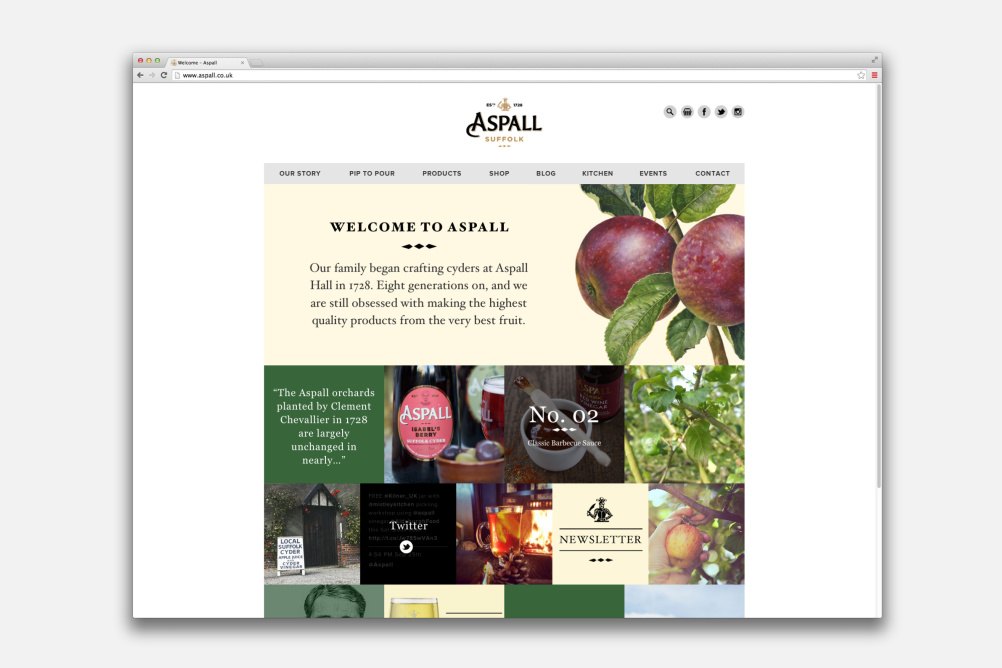
NB Studio created the designs having explored the archive of the Aspall family – which started the company in 1728 in the same Suffolk home that the family still lives in today.
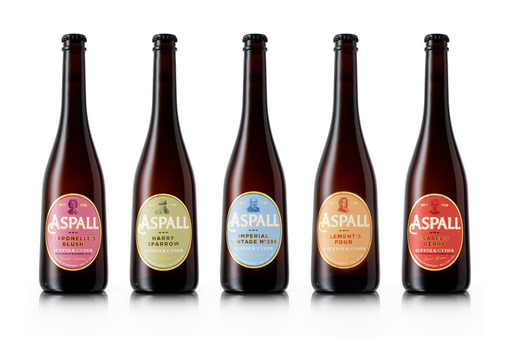
It used images of old marks, motifs, and photographs as inspiration for the new identity, looking to connect the look with the brand’s heritage.
NB Studio says: “With a number of the new-to-market cider products habitually ‘inventing’ heritage stories, the focus of this exercise was to identify assets that capture the unique quirks and eccentricities of a three-century-old family business, and of the family members themselves.
“Indeed the design team quickly coined the phrase ‘If it’s generic, it’s not Aspall.’”

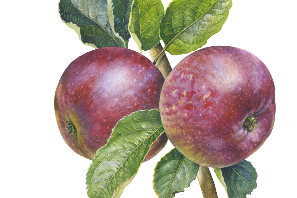
The design assets were created with a team of craftsmen assembled by NB Studio, including woodcut illustrator Christopher Wormell who redrew the Aspall Knight, writer Tom Lynham and artist Rosie Sanders, who created a series of botanical illustrations of apples.
Illustrator Jürgen Willbarth created portraits of the characters who have contributed to the brand’s history throughout the centuries.
NB Studio worked with brand strategist Debbie Taffler and communications expert Robert Phillips on the project, working to create a new strategy that helped Aspall cider stand out in its sector in the face of increased competition.

The new identity first launches on Aspall’s cider ranges, and will be rolled out onto vinegar products and new product developments over the coming year.


Nice work. I particularly like the woodcut.
My only criticism is that I would like to have seen better letterspacing/kerning in the Aspall name
I really don’t like it I’m afraid. Insipid colour scheme dilutes shelf and bar stand-out. New website also looks worse than the old one. Things going downhill at Aspall sadly as it’s a great brand