Art director’s choice
Asking a graphic designer their favourite logo of all time is often a bit of a minefield and difficult to pinpoint. Mine, however, is quite clean cut, in the form of Supreme New York’s identity.
Supreme opened in April 1994, and quickly established itself as the home of New York’s skateboard culture, developing a strong following amongst skaters, punks and hip hop fans. Through collaborations with some of our generation’s most groundbreaking designers, artists, photographers and musicians – including Damien Hirst, clothing brand Bathing Ape, photographer Terry Richardson and Peter Saville, to name but a few – it has evolved from a streetwear label to a highly sought after, exclusive brand.
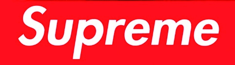
Supreme’s trademark logo, designed by the infamous graffiti artist Futura, has remained largely untouched in its 16 years and is a personal favourite of mine. Its strength lies in the simple two-colour design. Set in white Futura Heavy Oblique against a slash of red background, the Supreme logo demands immediate attention and could be perceived as a bold statement or command, strengthening its unique, timeless identity and attitude. The red background has been replaced with a variety of patterns over the years on special collaborations, some of which are pictured here and, whether used in isolation or as part of a composition, it maintains a strong presence.

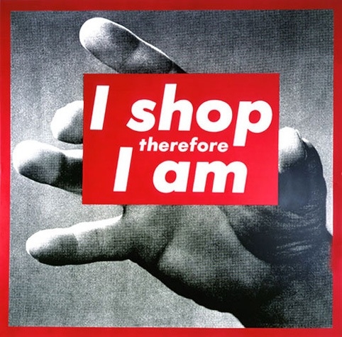
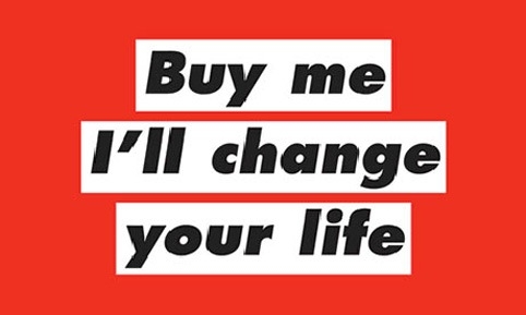
Anyone familiar with Barbara Kruger’s work will observe the reference to her most notorious pieces. In their trademark black letters against a slash of red background, some of her instantly recognisable slogans read ‘I shop therefore I am’ and ‘Your body is a battleground’.
This is an aesthetic that has been parodied and referenced many times in recent years, most notably by Selfridges in a campaign masterminded by Mother in 2007. Shephard Fairey’s clothing brand Obey has adopted a similar approach in its output with many of their designs built upon a limited red, black and white colour palette to deliver bold iconology based on an allegiance to media and popular culture.
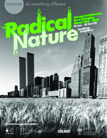
Further afield, the brand identity for London’s Barbican Art Gallery uses the same typeface and applies it, usually at an angle, to every exhibition that appears there.


Maliciously Fortunate