Design Bridge rebrands TNT
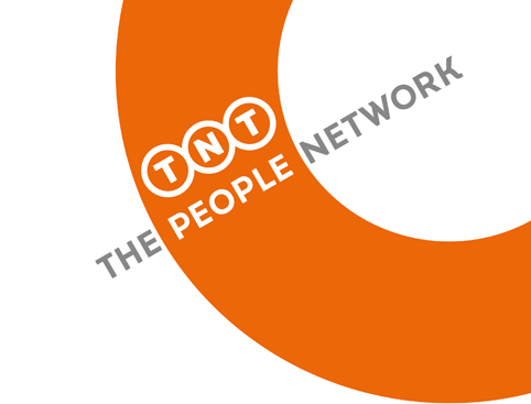
Design Bridge has rebranded delivery company TNT, positioning it as The People Network and creating a circular device which represents “perpetual motion”.
Design Bridge says it was asked to define a new strapline that would convey TNT’s new strategy and culture, and to design a new logo and brand expressions, which would “reflect TNT’s vision”.
A new strapline, “The People Network”, reflects the company’s aim to connect people and businesses in a “truly personal, rather than purely professional manner”, according to Design Bridge.
The consultancy hopes the new strapline will help “galvanise the ‘challenger’ spirit of those working internally at TNT”, as well as TNT customers.
TNT chief executive Tex Gunning, says: “Customers are not barcodes and we are not robots. We all relate to what drives our customers: business growth with a personal touch. Taking time to understand what customers really need distinguishes us from others. We are The People Network.”
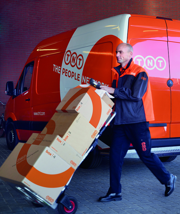
The new identity is held within a cropped circle device giving the impression of being part of a journey and of “perpetual motion moving through the world” says Design Bridge.
A global roll-out begins today across touchpoints including vehicle livery, uniforms and parcel packaging.
TNT Express is a division of TNT. The TNT Express company was formed when the TNT Group separated in 2011, creating two separate companies Post NL and TNT Express.
TNT Express kept the TNT name as part of the deal and TNT Post, (a Post NL company) agreed to rebrand by the end of 2014.
TNT Post rebranded as Whistl earlier this month in a project led by Sutcliffe Reynolds Fitzgerald.
Read this next

-
Post a comment


