Google has a new logo – we look at how it was designed
The search engine giant has updated its logo following the launch of the new Alphabet corporate entity last month.

Search engine Google is launching a new logo, which the company says “updates [the branding] for a world of seamless computing”.
The new identity has been created by Google’s in-house design team. Designers from across the company, including Creative Lab and the Material Design team, were brought together in New York earlier this year for a week-long “design sprint”.
The design team says it wanted to look at four challenges:
- “A scalable mark that could convey the feeling of the full logotype in constrained spaces.”
- “The incorporation of dynamic, intelligent motion that responded to users at all stages of an interaction.”
- “A systematic approach to branding in our products to provide consistency in people’s daily encounters with Google.”
- “A refinement of what makes us Googley, combining the best of the brand our users know and love with thoughtful consideration for how their needs are changing.”
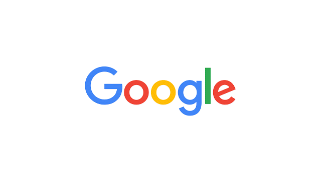
Distilling the brand to its core and building it back up
The team says: “We started by distilling the essence of our brand down to its core — four colours on a clean white background—and built it back up.”
The new san serif identity uses a custom typeface retains the original Google colour sequence.
The design team says of the new logo: “The Google logo has always had a simple, friendly, and approachable style. We wanted to retain these qualities by combining the mathematical purity of geometric forms with the childlike simplicity of schoolbook letter printing.”
Playful and unconventional
The team says the new logo “maintains the multi-colored playfulness and rotated ‘e’ of our previous mark—a reminder that we’ll always be a bit unconventional”.
Google says its new logo “will reflect this reality and show you when the Google magic is working for you, even on the tiniest screens”.
As part of the rebrand, Google is ditching its blue “g” icon and replacing it with a four-colour “G” to match its logo. It is also bringing in new elements such as a “colourful” Google microphone.
A new Google “G”
The design team says: “The Google G is directly derived from the logotype ‘G,’ but uses increased visual weight to stand up at small sizes and contexts where it needs to share space with other elements.
“Designed on the same grid as our product iconography, the circular shape was optically refined to prevent a visual “overbite” at the point where the circular form meets the crossbar.
“The colour proportions convey the full spectrum of the logotype and are sequenced to aid eye movement around the letterform.”
A new “Google Dots in Motion” graphic has also bee introduced. The design team says: “The Google dots are a dynamic and perpetually moving state of the logo. They represent Google’s intelligence at work and indicate when Google is working for you.
“We consider these unique, magic moments. A full range of expressions were developed including listening, thinking, replying, incomprehension, and confirmation.”
As part of the rebrand, the Google colours have also been updated “to maintain saturation and pop”, and a new Product Sans typeface has been introduced.

The new look follows the introduction of the new Alphabet corporate identity, which is used to operate a collection of businesses, including the search engine.
The Google brand will continue to exist, but at a holding level the new Alphabet identity will be used, with Alphabet Inc replacing Google Inc as a publicly traded identity.
Google says of its new identity: “So why are we doing this now? Once upon a time, Google was one destination that you reached from one device: a desktop PC.
“Google of the future”
“These days, people interact with Google products across many different platforms, apps and devices – sometimes all in a single day.
The company says: “This isn’t the first time we’ve changed our look and it probably won’t be the last, but we think today’s update is a great reflection of all the ways Google works for you across Search, Maps, Gmail, Chrome and many others. “
“We think we’ve taken the best of Google (simple, uncluttered, colorful, friendly), and recast it not just for the Google of today, but for the Google of the future.”
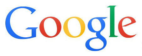
This is Google’s first major update to its logo since 2013, when it introduced a “flat” identity.
Discover more:
• Google rebrands as Alphabet – but new identity “will not be a big consumer brand”


Why dropping the loopy lowercase ‘g’ ? there is plenty of beautiful sans serif with more ompf out there (Meta, akurat to name only two). Google In-house designer are obviously UX geniuses, but lack of Typographic knowledge; as a result, this logo lacks of character and only looks alive when animated.
the “e” reminds me a lot of the Heineken laughing “e”, and seems a little off balance with the rest of the design
My initial reaction was “god, no”… but seeing it along side everything in the video I have changed my mind. I don’t LOVE it but its good. I like it.
Its a step forward but so obvious
Have no one heard the phrase ‘if it ain’t broke, don’t fix it?’.
Modern, relevant if a little clumsy typographically. But a good move forward. Hope they still keep the topical treatments…