Made in North Korea: the book exploring a totalitarian state’s graphic design history
As Phaidon releases a new book looking at 20 years’ worth of graphic ephemera from North Korea – ranging from stamps to sweet wrappers – we speak to the author Nicholas Bonner about his fascination with the design aesthetic of the notoriously unstable and little-understood country.

Design Week: Tell us about your own background and how you became interested in collecting graphic ephemera from North Korea?
Nicholas Bonner: I originally trained as a landscape architect and was a lecturer at Leeds Metropolitan University. In 1993, I took a trip to China and North Korea and found North East Asia so exciting that I stayed. I based myself in Beijing – the best place to maintain regular contact with North Korea. I set up a travel company called Koryo Tours with a friend, so we could get regular visas that would allow us to keep visiting the country. We progressed from tourism into cultural projects such as documentaries, a feature film and sports exchanges.
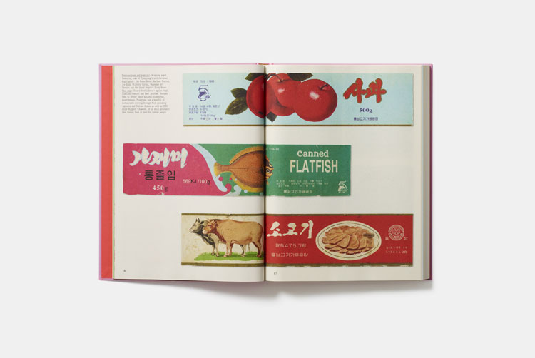
On all of these trips I kept collecting graphic elements that I was attracted to. Before the arrival of digital technology heralded the end of hand painted, retro graphics, North Korea’s packaging design was not considered to be advertising. Its purpose was to inform you of the contents in a simplistic, almost innocent way, although it was often jollying up rather mundane contents. In the end I had numerous boxes full of graphic ephemera, which became a carefully curated collection.
DW: Is the book the first comprehensive survey of North Korean graphic design?
NB: The graphics are representative of North Korea graphic design, but the intention was never to collect a comprehensive collection. The actual items are “found objects” that I came across in the country and gradually built up over the years, so they are wide ranging both in terms of type and design. The items were chosen for selection in the book because of the strength of their graphic design, or the story they told about the country. They do not include North Korean propaganda posters, fine art, trademarks designs and so on, but these are perhaps books for the future.
DW: Can you give some examples of the designs that are included in the book?
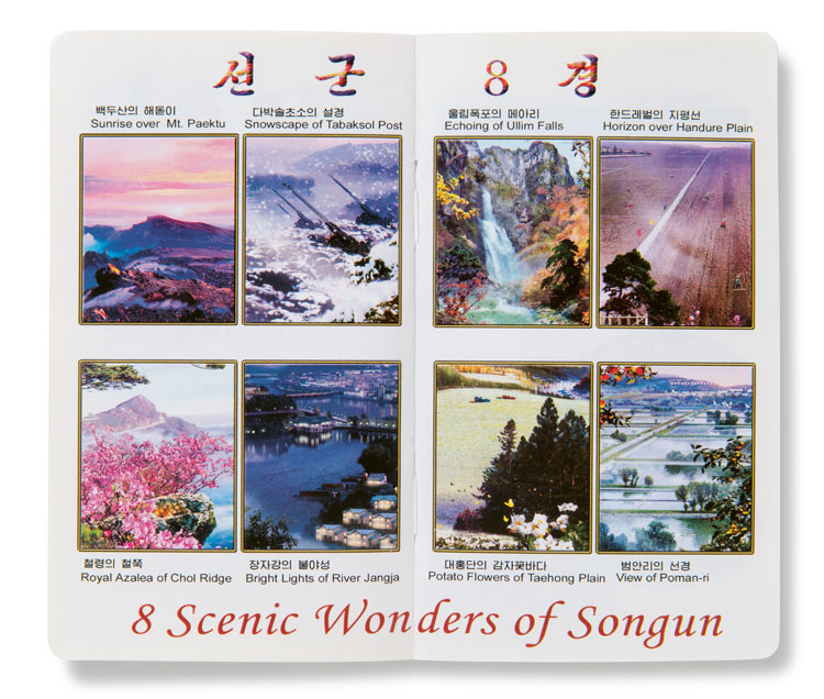
NB: It is the variety of designs that I find so fascinating, ranging from the propaganda style New Year postcards – which are bold with a very clear message both in terms of the image and text – to the frivolous, pretty design of Rakwon Department Store’s wrapping paper. One of my favourite objects is the paper fan with the Air Koryo graphic, which were used on the flights between Beijing and Pyongyang during July and August because of the heat and humidity at that time of year. They were only brought out during these months every year and handed around for onetime disposable use, but were beautifully illustrated and made.
DW: Do you think there is a distinctive North Korean design aesthetic?
NB: The symbolism used in many of North Korea’s graphics is unique to the country. For example, every North Korean seeing an image of the Kangson Steelworks – which symbolises the industrial capacity of their country – knows that the product is selling itself as strong and reliable. The Kumgang Mountains are meant to be representative of products associated with vitality and health, and pine trees and flying cranes symbolise longevity. External influences were at one time almost non-existent, but from 2002 economic changes within the country meant that there were more foreign products arriving. One brand of North Korean cigarette called Paekdusan certainly tried to emulate a Western high-quality brand. Known locally as the “Korean Rothmans”, it not only tried to emulate the taste of the cigarette but also the style of packaging.
DW: What do you think North Korea’s style of design tells you about the nature of the country itself?
NB: It is perhaps because the country is so isolated that the graphics have remained unchanged for such a long period. This isolation allows the propaganda to actually work, as there is very little to compare and contrast with it. For example, the capital city Pyongyang has a strong presence in graphic design. In an extension of the idea that “our country is best”, it is presented to North Koreans as one of the world’s great cities – even though few have experience of visiting any others.
DW: Why do you think it is important to preserve pieces of design history like this?
NB: It is important in terms of archiving graphic designs, but there is also an academic argument. Everything in North Korea is state-owned, therefore even the design and products reflect how the nation portrays itself. It shows not only how they package their home-grown products to an internal market, but also their export goods to the former Communist Bloc. Much of the packaging is cheap and ephemeral, and examples are being lost even in North Korea simply because there is no associated value to them. Some of my North Korean friends also find the book rather strange, asking me why I would collect throwaway items. However, to many older Koreans it is a book that allows them to reminisce about their youth.
Made in North Korea: Graphics from Everyday Life in The DPRK costs £24.95, and is available from Phaidon.


Read this next
-
Post a comment


