Hype Type Studio’s cute bear branding for electronics accessories company
Los Angeles-based consultancy Hype Type Studio has created the identity for uBear – a Californian mobile phone, tablet and laptop accessories company.
Hype Type Studio was formed by British designer and art director Paul Hutchison, who was approached directly by uBear for the project.
Hutchison says, ‘Our brief for the uBear logo was to create an identity that would be both adaptable and instantly recognisable.’
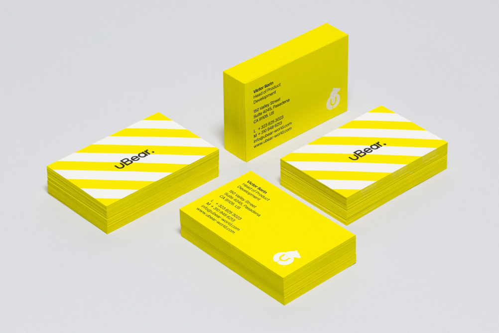
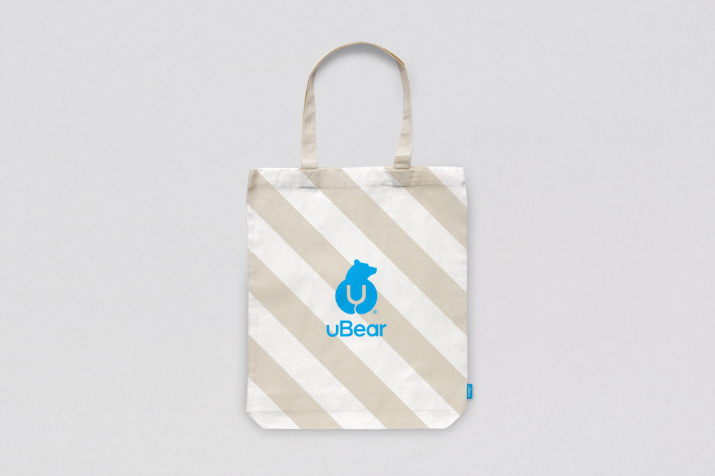
The logo uses a graphic of a bear hugging the letter ‘u’, with a word-mark created with a custom sans serif typeface.
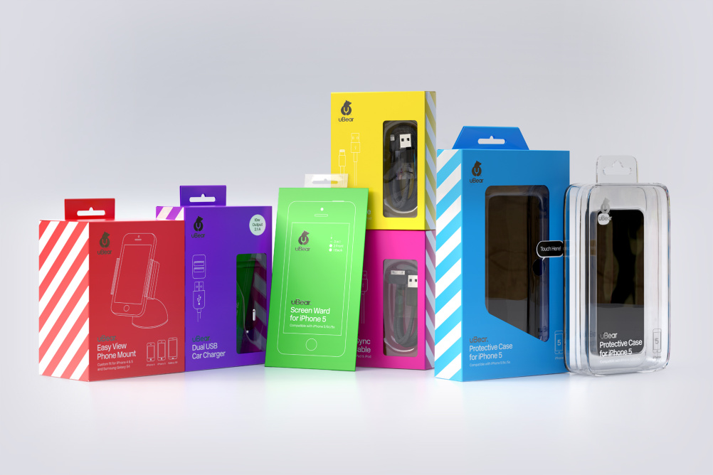
Hype Type Studio worked with Mash Creative to create the branding and packaging for all the products in the uBear range, using a ‘unique, bold and bright colour palette’ that aims to make the brand stand apart from its competitors.
Finishes such as gloss varnishes and metallic foils are used throughout to further enhance interest on-shelf, Hutchison adds.
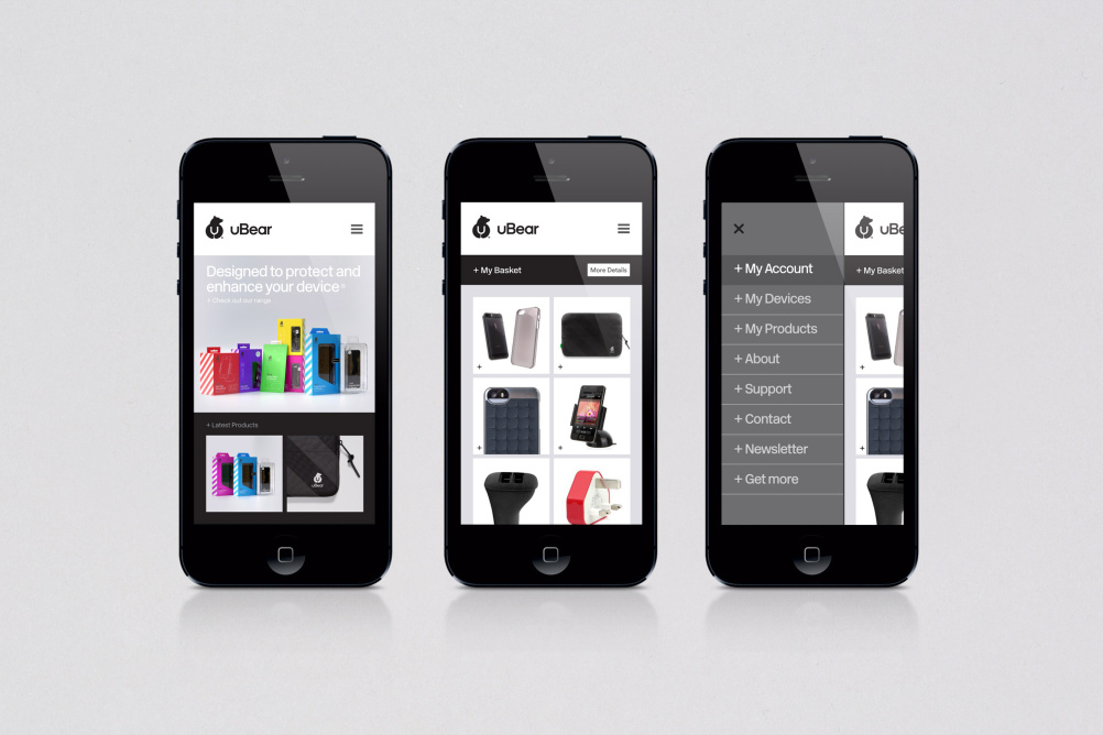
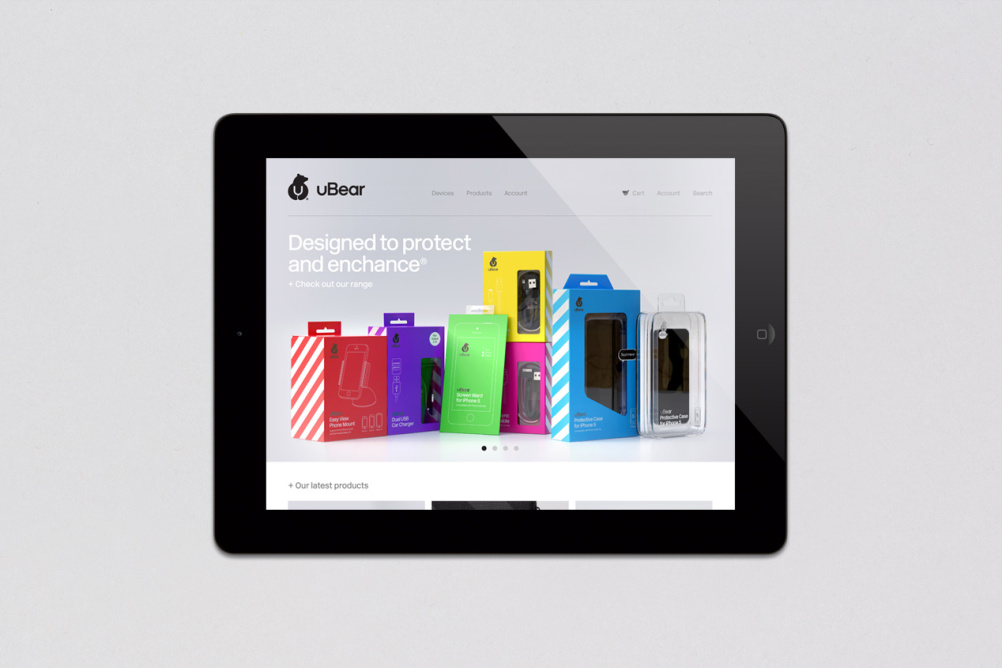
Hype Type Studio also created the uBear website, which is fully responsive across all devices. This shows information and product photography by György Kőrössy.


I do like a well turned out symbol and this is beautifully executed.
I can also see how the bold colours and stripes bring the visual vocabularyt of hardwearing industrial ‘protection’ to the table – and deliver strong shelf standout.
But I can’t help thinking it’s a bit of a shame the bear symbolism appears to end at the logo.
Could you have included bear habitats in the visual vocabulary. Could claw-marks on a tree signify scratch protection?
Water and cold protection products could be ‘Polar’. Tough crash protection could be Grizzly. Backpacks could be Koala. The recycled, sustainable range could be ‘Brown’. Or am I just drowning in too-cuddly bear schmaltz.
Ignore me. You did a good job.
michael zimmerman hedge fund michael zimmerman hedge fund michael zimmerman hedge fund http://content.time.com/time/magazine/article/0,9171,2147697,00.html