The biggest rebrands of 2014
Take a look at our coverage of the year’s biggest identity design stories.
January
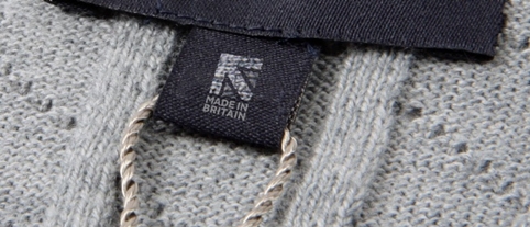
The year started with a new identity for the Made in Britain campaign, created by The Partners. Made in Britain is an initiative to promote British-made products and the new identity replaced a previous logo that was designed after a student competition. The Made in Britain identity went on to win the identity design category at the 2014 Design Week Awards.
Power tool company Black + Decker unveiled a new identity, developed by Lippincott. The new identity met with a mixed reaction from DW commentators, not least because of the replacement of the & symbol with a +…
Fitness First introduced a new identity, created by The Clearing, which saw the brand’s blue and white colours replaced by a red to symbolise “energy and strength”. Alongside the rebrand, the Fitness First interiors were refurbished by Checkland Kindleysides.
Wolff Olins overhauled the Virgin Media branding, dropping the Union Flag from the logo, which had been introduced by Start JudgeGill in 2011.
February
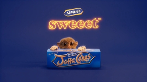
JKR gave biscuit brand McVitie’s a new identity as part of a £12 million relaunch of the company. This included a marketing campaign that apparently aimed to evoke “the emotional role biscuits play in our lives”.
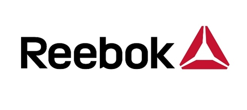
Reebok launched a new brand mark which it dubbed “Reebok Delta”. It apparently aims to reflect the brand’s new “singular focus on fitness”.
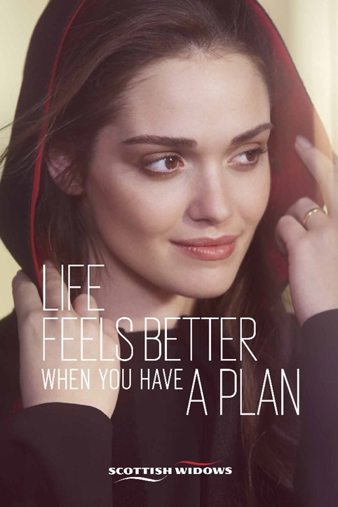
Insurer Scottish Widows updated its branding, with identity design elements created by Rufus Leonard and a campaign led by 101. The project also involved the introduction of a new Scottish Widows “Widow”…
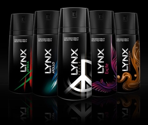
And teenage boys’ favourite Lynx got a new look, with branding developed by Elmwood and new structural packaging created by SeymourPowell – including a “lockable” spray button.
March
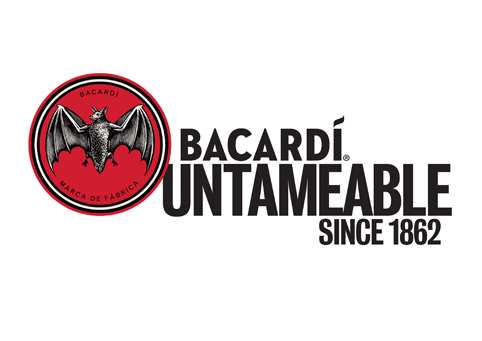
Rebrands were rather thin on the ground this month, but there was this interesting new identity for Bacardi rum, created by Here Design. The consultancy redrew the brand’s bat icon, taking influence from earlier Bacardi designs.
April
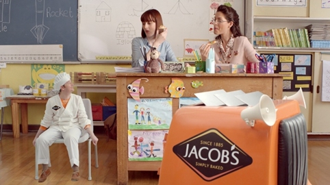
After rebranding McVitie’s earlier in the year, JKR turned its attention to fellow United Biscuits brand Jacob’s. The rebrand featured the creation of a new master identity, packaging and an ad campaign.
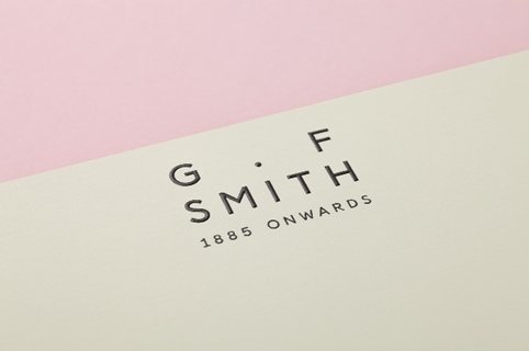
Made Thought developed a new identity for paper company G.F Smith. The rebrand project included the creation of two new marks, as well as a new typeface and other elements including a “Collection Wall” of paper at the brand’s warehouse.
May
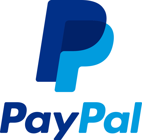
US consultancy Fuseproject created a new identity for payment service PayPal. The new identity contains four elements; a new wordmark and typefaces, a new monogram of PayPal’s double PP’s, a new dark and light blue colourway and a “dynamic angle graphic”.
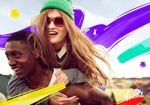
V Festival launched a new identity, created by Saffron, based around the concept of “bring the vibe”.
June
Following the merger between publishing giants Penguin and Random House, Pentagram partner Michael Bierut designed the identity for newly formed company… Penguin Random House.
Nestlé’s instant coffee brand Nescafé launched a new, unified look and feel across all its products worldwide. Identity design work was carried out by CBA Design Paris.
New York’s Cooper Hewitt Museum reopened at the end of the year following a £54 million refurbishment project. Ahead of its reopening it unveiled a new identity, created by Pentagram partner Eddie Opara.
July
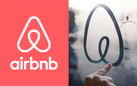
Airbnb launched a new identity, created by DesignStudio, based around the new “bélo” icon – a “symbol of belonging”. The new logo was pounced upon by social media critics, who rather bizarrely compared it to both male and female genitalia.
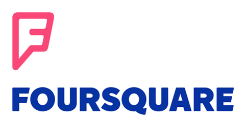
Social geo-location service FourSquare launched new branding as well as a new interface and functionality. The new identity was created by Brooklyn-based consultancy Red Antler.
August
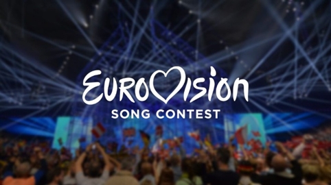
August was, perhaps unexpectedly, rather a busy month for new brand launches. The month kicked off with a new identity for the Eurovision Song Contest, which was created by Amsterdam-based consultancy Cityzen Agency. The new branding is an evolution of the contest’s heart logo, which was introduced ten years ago.
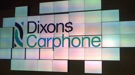
Dixons and Carphone Warehouse announced in May that they would be merging the two companies. Subsequently, the newly launched entity opened its doors in August, glorying under the name Dixons Carphone. Branding for the new company was created by AMV/BBDO.
Landor created the new identity for the World Trade Center development in New York – a complex of buldings on the site of the original Twin Towers which were destroyed in the attacks on 11 September 2001. Thw new logo is heavy with symbolism with, for example, each of the five bars in the logo representing one of the five towers that will make up the new World Trade Center. Two empty columns at the top represent the Tribute in Light memorial that will be built on the site, while the two columns below them represent the twin pools of the National September 11 Memorial.
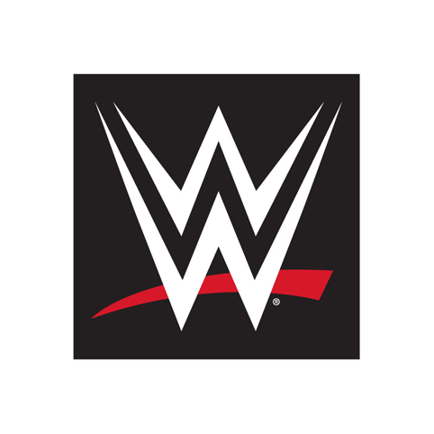
Also in August, WWE “pinned down” (ha ha…) a new look. The new World Wrestling Entertainment logo is the fourth incarnation of the brand that started out as the World Wrestling Federation in 1982.
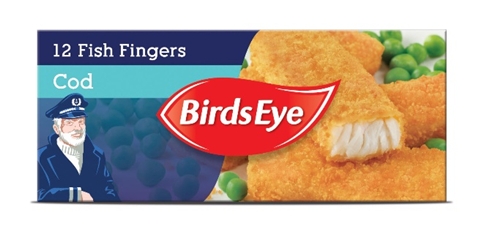
Following its work on McVitie’s and Jacob’s, JKR was again behind one of 2014’s big fmcg relaunches. New Birds Eye branding and packaging designed by by the consultancy hit the shelves in August as part of the company’s £60 million relaunch.
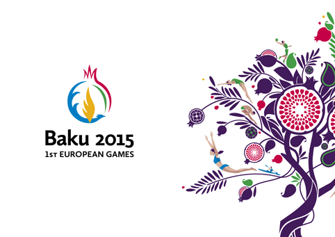
SomeOne created the identity for the first ever European Games, a sporting event that will be held in Baku, Azerbaijan, next year. The logo itself was unveiled in November 2013 and was created by Azerbaijani designer Adem Yunisov and features the pomegranate fruit. SomeOne says the pomegranate tree – which symbolises unity in Azerbaijani folklore – is also integral to the new branding, which features tree branches interwoven with symbols of Azerbaijani culture and heritage.
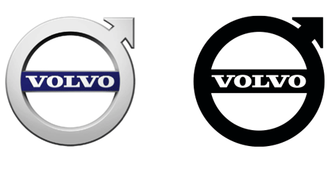
Volvo updated its identity with the launch of its new XC90 vehicle. The updated “ironmark” logo was created by Swedish consultancy Stockholm Design Lab. The ironmark has been in use since 1927 and is based on the chemical symbol for iron.
September
Channel 4 launched a new All 4 identity, which will represent all of Channel 4’s digital output and replace the 4oD branding. The new identity was designed 4Creative team, working with Magpie Studio and We Are Seventeen, while the overall branding was developed by 4Creative and We Are Seventeen. Channel 4 says the new branding is “derived from the iconic Lambie-Nairn Channel 4 logo”.
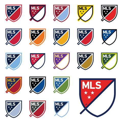
The USA’s Major League Soccer rebranded with a flexible identity that can be adapted to feature the home colours of every team in the league. An in-house team worked with US consultancies Gigunda, Athletics and Berliner Benson to develop the new identity.
October
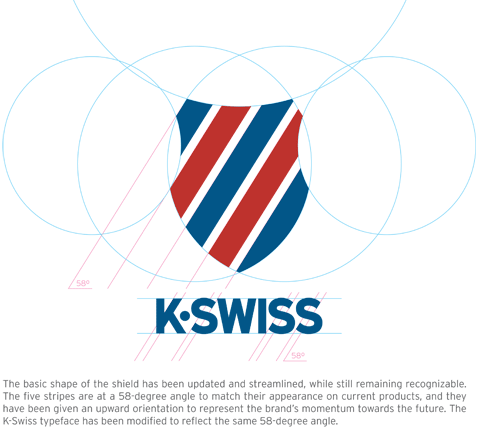
Following the relative quietness of September, October was another busy month on the rebrand front. Shoe brand K Swiss rolled out a new identity which it says pays homage to its place as the only US heritage tennis brand. The new look was created by a newly appointed internal creative team.
NB Studio created a new look for apple products brand Aspall, designing the new identity alongside an assembled team of craftsmen including woodcutters and botanical illustrators.
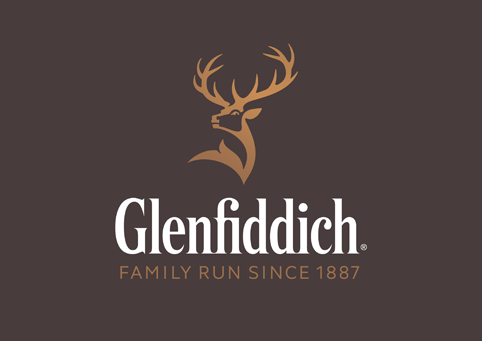
Purple Creative overhauled the Glenfiddich Single Malt Scotch Whisky brand, creating a new identity, colour system and brand expressions.
Portuguese consultancy Brandia Central, which has created identities for football tournaments around the world, including Euro 2012 in Poland and Ukraine and Euro 2016 in France, unveiled the identity for the 2018 World Cup in Russia. The new identity references the Sputnik spacecraft and Russian icon art techniques.
November
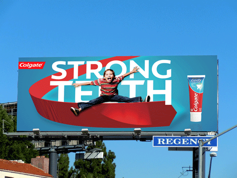
Colgate rolled out a new identity, created by The Partners’ New York office, which features a redrawn logo and a new chevron device. The new branding also features a bespoke typeface created by Fontsmith.
Pizza Hut launched a new identity in the US in what the restaurant chain says is its “biggest brand evolution ever”. The new look was developed with ad agency Deutsch, and takes in a new identity, box designs, website and staff uniforms.
December
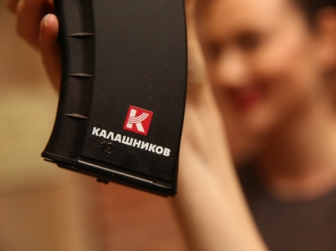
Right at the end of the year came what is probably 2014’s most controversial rebrand. Russian company Kalashnikov, known for making the AK-47 assault rifle, launched a new identity as it looked to position itself as a “Protector of Peace” (really). Russian consultancy Apostle Center for Strategic Communications was behind all of the rebranding work.
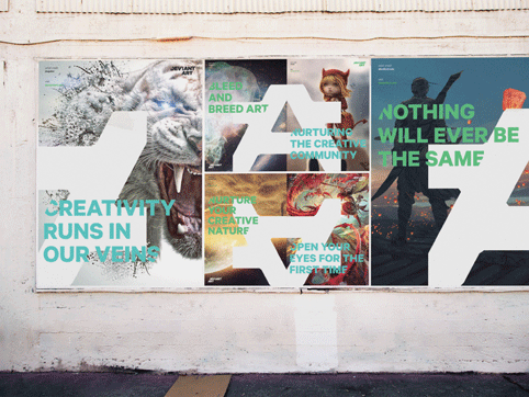
And finally, Moving Brands created a new identity for DeviantArt, an online community that allows users to share and discuss artworks.

-
Post a comment


