HIV charity rebrands as Frontline AIDS to help tackle “prejudice”
Brandpie has carried out the rebrand, creating a new identity system which uses a “loud” colour palette and the charity’s own photo library, inspired by “the early days of AIDS activism”.

Design studio Brandpie has renamed and created a new look for the HIV charity now known as Frontline AIDS.
Previously known as The International HIV/AIDS Alliance, the international non-governmental organisation (INGO) has more than 25 years of experience working “on the frontline” to help combat HIV and AIDS.
Set up in 1993, the charity works with community groups around the world to help marginalised people get access to HIV treatment or prevention, focusing on human rights. It now operates in more than 40 countries.
Human Immunodeficiency Virus (HIV) is a virus that can be transmitted from person to person through blood and other bodily fluids, through means such as unprotected sex or sharing needles. The virus weakens a person’s immune system and inhibits their ability to fight infections.
Someone can then contract Acquired Immune Deficiency Syndrome (AIDS), which is the name for a set of potentially life-threatening infections and diseases, when a person’s immune system has been sufficiently damaged by HIV.
There is no cure for HIV, but there are treatments which help people with the virus live long and healthy lives, according to the NHS.
Scott Snashfold, design director at Brandpie, says the rebrand comes at a time when AIDS is slipping from the agenda of governments globally.
The rebrand aims to “stimulate a renewed focus on finding innovative approaches” to ending the AIDS epidemic and bringing it back to people’s attention, he says.
But he adds that the primarily “biomedically-driven response to ending AIDS by 2030” which is currently “the global aspiration”, is no longer enough, as “we are nowhere near to realising this goal.” There are also social and human rights issues that also need to be considered, he adds.
“The most marginalised groups in middle-income countries still face prejudice and inequality, which creates barriers to access treatments they need to prevent the spread of the virus,” he says.

The charity’s new name has been chosen in a bid to reaffirm its position as “a human rights-focused INGO”, which is active on the “frontline”.
The charity’s old name was “no longer fit for purpose” as it was “too long and tended to be reduced to an acronym or just ‘Alliance’,” Snashfold says.
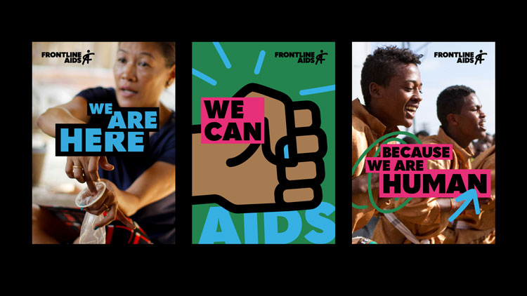
The new “bright and bold” visual identity features the words Frontline AIDS in Quasimoda Heavy, a sans-serif, all-capitals typeface, aligned left.
On the right of the wordmark is a symbol which resembles a stick-person, but also features the letters F and A combined in one symbol, in a hand-drawn style.
Other letters from the charity’s name, such as a lower case “I” and a backwards “R” can also be seen within the symbol.

“The symbol has a strong and defiant stance,” says Snashfold. “Its simplicity makes it accessible to everyone. Frontline wanted people across its communities to feel they can put the symbol on placards, on walls, on their faces — wherever Frontline AIDS needs to be.”
The palette features bright, contrasting colours including blue, green, pink and black.
Snashfold says the “loud” colour palette has been designed to “help the organisation make some noise”. “Everything clashes and it’s not classically elegant, but that’s the point,” he adds.
Brandpie has also worked on the charity’s tone of voice. Charity posters feature various messages, such as “can you see what the world can’t?” and “kissing stigma goodbye”, mainly laid out with the words inside boxes of contrasting colours.

The new look takes inspiration from signs and placards during the “early days of AIDS activism” in the 1980s, Snashfold adds, in a bid to “bring that urgency back.”
Imagery used throughout the brand features photographs of people affected by AIDS and their communities from the charity’s picture library, which the charity has been collecting since it was founded in 1993.
Snashfold says photography associated with charities is often “full of clichés”, and as such, gives a “false impression” of the situation. The photos used in Frontline AIDS branding aim to tell “the real story” of AIDS, he adds.
While some photos are quite upbeat and natural, featuring smiling people, others are more abstract.

One example features a person with a condom in their mouth, with the words “we won’t be silent again” in the centre of it.
The photograph is referencing sex workers being “taught safe sex techniques, such as secretly applying condoms with their mouths during oral sex,” Snashfold says.
This sort of photography aims to highlight the human rights issues that prevent people accessing help, he adds, as in countries where people are persecuted for their sexuality, “the fear of retribution can outweigh coming forward”.

“These issues can make for uncomfortable discussions that people naturally shy away from,” he says. “But it is the unseen, real story of AIDS that the world must see, and to be on the frontline means to tackle these sensitive topics head on.”
The new branding will be rolling out across all touchpoints, including posters, communications, social media and merchandise, in the coming months.
The new identity also includes refreshed brand guidelines, a brand film for use on social media and a new content strategy for the charity website and print materials, focusing on people’s “frontline” stories.
The Frontline AIDS website has been created by Brighton-based digital design studio, Tilt, using the brand guidelines provided by Brandpie.


-
Post a comment


