Designing the identity of RuPaul’s Drag Race UK
The identity of the first ever international edition of the show draws heavily on its UK setting, says the team at BBC Creative.
This evening sees the premiere of RuPaul’s Drag Race UK, the hotly anticipated UK edition of the cult US show.
The original series achieved success with a combination of over-the-top set designs, countless pop culture references and flamboyant personalities. This, alongside some genuinely candid discussions on topics as diverse as the Stonewall riots, marriage equality and living with HIV, cemented it as both a pop culture staple and an LGBTQ+ institution.

Designing the identity of the UK edition, however, presented entirely different challenges, not least because of the legacy of the act it has to follow. For months the team at BBC Creative worked to position the show, creating among other things, the first trailer for the series.
“The UK drag scene is very different to the US, so the campaign had to feel authentically British,” say Charlotte Humphreys and Olga Chwilowicz, creatives at BBC Creative. “We wanted to celebrate the distinct differences we have with the US scene and looked at British fashion, iconic films and sitcoms.”
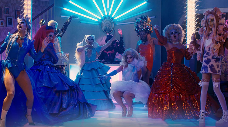
The first trailer for the series – indeed one of the first real looks into the positioning of the show in general – sees the queens in a home setting. Humphreys and Chwilowicz say this is intended to convey the “sisterhood” of the show and its contestants.
Mama Ru’s in search of the UK’s very first drag race superstar. Prepare for the ride of your life!@BBCThree‘s #DragRaceUK lands Thursday 3rd October from 8pm. Only on iPlayer. pic.twitter.com/vF8UYVPl91
— RuPaul’s Drag Race UK (@dragraceukbbc) September 19, 2019
“We set the launch film in a typical family sitcom full of eclectic furniture, nostalgic typography and comedic moments… bringing to life all the nuances and brilliance of drag,” they say, adding that everything has been designed to appeal to the British sense of humour in an attempt to attract fans both new and old.
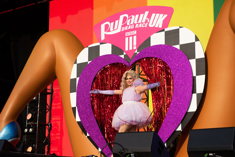
Beyond the first trailer, Humphreys and Chwilowicz worked to create a UK distinction across the rest of the show’s visual identity, including a launch event at Manchester Pride. “We noticed the US iconics of the queens showed them all looking to the camera against a bright flat colour,” they say. “But we wanted our poster to be full of life, bursting with the queens’ personalities.

“We looked at accidental renaissance photos and with Ru centre stage, we captured the queens looking fierce and interacting with one another.”
While the team were keen to focus on the show’s UK setting, British stereotypes are nowhere to be seen in the branding of the show. “We didn’t want to use obvious tropes like royalty or Union Jacks,” they say.
“Instead we looked at what makes this show truly brilliant and captivating – RuPaul, the personalities and talent of the queens and the sense of a welcoming family.”

Cover photo courtesy of Leigh Keily/BBC/Matt Burlem.
-
Post a comment


