
Fleur of England redesign avoids “frills” of traditional lingerie branding
Led by the team at Popp Studio, the lingerie brand’s new look features a redrawn logo and wordmark, as well as a rethought colour palette and packaging.
International lingerie brand Fleur of England has been rebranded by Peckham-based Popp Studio, in a bid to modernise the 19-year-old label.
Fleur’s creative director and founder Fleur Turner approached Popp having seen previous examples of the studio’s work with another client. Having recently updated the brand’s ecommerce offer and expanded its range, Turner got in touch with the team in a bid to modernise.
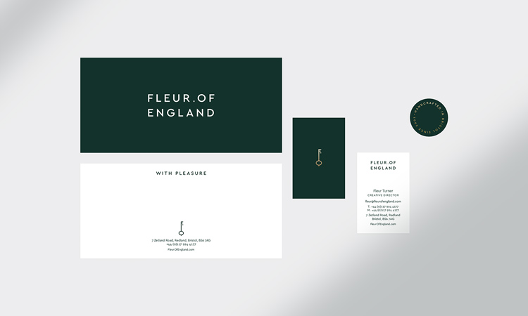
The new look for Fleur of England includes a redrawn logo and wordmark, redesigned packaging, and a rethought colour palette which “doesn’t allow pink to dominate”, as it often does with the brand’s competitors.
According to Popp Studio managing director Andrew Slade, there were three main driving forces behind the changes instituted in the project. The first, he says, was Fleur’s mission to encourage “modern sensuality”.

Examining the brand’s competitors revealed what Slade calls an “old-fashioned idea of what women like” – an over-use of pink and stereotypically “feminine” script typography stood out in particular.
“We wanted to put some distance between Fleur and other brands in the sector,” Slade tells Design Week. To do this, the team got rid of the cursive script of the old logo and introduced in its place a sans serif typeface that took its cues from modern high fashion house branding.
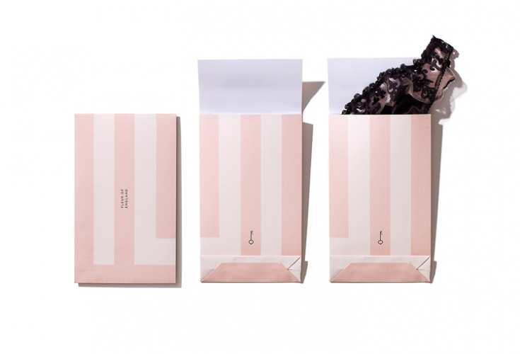
Additionally, because Fleur of England wanted to keep some acknowledgment of pink in the colour palette, the Popp team devised a new scheme which used more muted tones of blush, supported by other colours.
The idea was to “make sure pink wasn’t the first thing you noticed when you looked at the brand”, says Slade. Drawing on Fleur’s association with gardens – Slade explains that Turner thinks of her brand as if it were a living, secret garden to which customers have the key – the team introduced a deep green colour to the mix, along with white and accents of gold.

“A lot of other brands we looked at used black and white to evoke this idea of sensuality – we’ve done a similar thing with our green and white to achieve that contrast of light and dark, but in a way we feel stands out more,” Slade says.
Beyond wanting modernity and a nod to Turner’s garden outlook, the brand also wanted to emphasise its mission to deliver “the perfect fit”. To depict this, Popp used a graphic of a key, which Slade says sits at the intersection of all these ideas.

“It represents the ‘key’ to the perfect fit, because Fleur of England understands that when something fits properly, that’s when wears feel their most confident,” Slade says. “And it also gives a nod to Fleur’s [Turner’s] secret garden idea.”
One final alteration to the brand came in the restructuring of the wordmark, which sits under the key graphic across communications and packaging. As Slade points out, while the word England doesn’t necessarily register as hugely important for British customers, in the 18 other countries in which Fleur of England’s products are sold, it “holds a certain gravitas”.
Moving “England” to its own line allowed it to take centre stage, Slade says, while the use of the fullstop after Fleur is designed to give prominence to Turner herself and show that she is the creative behind the brand.

Read this next

-
Post a comment


