The identity for a disability-inclusive housing group resists “outdated perceptions”
Landscape has created the illustrative new look for the organisation, with details that aim to “reflect the diversity of disability”.
San Francisco-based design studio Landscape has crafted the identity for disability-focused housing start-up The Kelsey, informed by inclusive design principles.
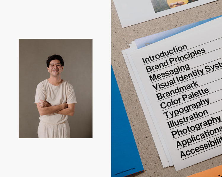
The work includes a new logo, illustrations, animations as well as a series of portrait photography which was shot in-house at Landscape.
Based in California, The Kelsey is a non-profit organisation that aims to prompt innovation in multifamily housing for people living with disabilities.
It works with community leaders, investors and developers and is currently advancing a pipeline of over 240 houses worth almost £130 million.
Portraying disability in “more progressive ways”

Landscape founder and creative director Adam Weiss says that the studio spoke to a broad group of people with and without disabilities across housing, architecture and investing sectors to understand the “distinct perspective and influence of the organisation from all angles”.
Several aims emerged from this co-design process. The first was to distinguish The Kelsey from the stereotypes of “slower-moving non-profits” and align it more closely with a “fast-moving start-up”, Weiss adds.
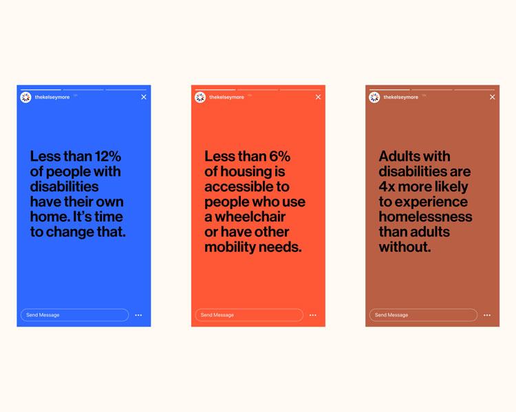
The second was to tell stories of people with disabilities in “more progressive ways”, he says. This included language used to frame topics as well as resisting “outdated perceptions” of disabled people.
The team also learned about the Curb-Cut effect, which shows how improved accessibility for people with disabilities benefits everyone. The term originiated from concrete poured by disability activists, which made roads safer not only for people in wheelchairs but everyone crossing the street.
“As meaningful and accessible as possible”
One of the session’s mantras, ‘Nothing about us without us’, informed the new identity system, according to Weiss. It meant working with the Kelsey’s staff and external consultants to make sure each visual detail was “as meaningful and accessible as possible”, he adds.
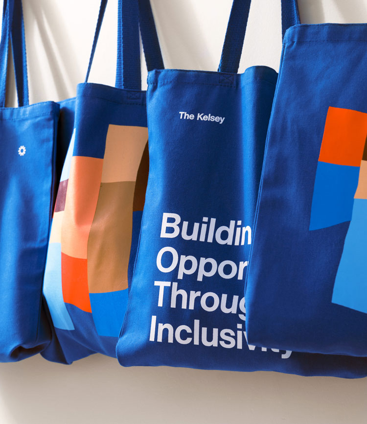
A circular logo, which can be animated, was designed to represent The Kelsey’s motto: ‘Building Opportunities Together’. This also ties into one of the themes from the initial discussions about the organisation’s “convening power”, Weiss says.
“We wanted to create a strong while still optimistic symbol to signify the meaningful work, diversity, and advocacy The Kelsey is moving forward in our communities,” Weiss says.

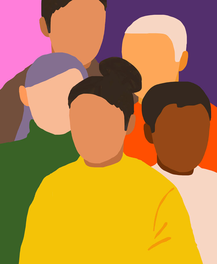
Illustration is a significant part of the new identity. The medium allows “a layer of expression that signals the collective diversity, perspectives, and creativity as a positive, vibrant power to shape a better society,” Weiss adds.
The design team considered a few illustrative approaches, from “strictly graphic to more gestural and handmade”, Weiss says. In the end, the two styles were merged, with colours chosen for adding “levity and joy”, he adds. “The subtle expressiveness of forms helps to humanise the abstract without going so far as to feel unintentional,” according to the designer.
The colour palette consists of bright hues and skin-tone shades. It was chosen to “reflect the diversity of disability that makes up The Kelsey’s vibrant communities”, Weiss says. It’s been calibrated in tone and contrast to accommodate people with vision-related access needs.

Neue Haas Grotesk has been chosen as the typeface. This pick combined accessibility without negating a “punchy and graphic” look, Weiss says.
All the photography was shot in-house by Landscape at a day-long session with the extended Kelsey community, the designer adds.
“The images reflect both the genuine connections between people of all abilities and convey a strong sense of everyone’s optimism and excitement about The Kelsey’s work,” Weiss says.

What do you think of The Kelsey’s identity? Let us know in the comments below.
-
Post a comment


