Tundra gets delicatessen logo design down to a T
A bar and delicatessen called T will open in The Tea building media complex in London’s Shoreditch this month, with interiors designed by Matt White and an identity by Tundra.
Tundra, which was appointed in April without a pitch, is also creating graphics, including menus and stationery, and has designed three bespoke wallpaper panels to feature in the bar, which are likely to be updated seasonally.
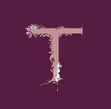
According to Tundra director Karine Faou, the group was briefed to create a feminine and organic logo and has designed an ‘Art Nouveau style’ marque that features the letter ‘T’ with tea leaves climbing around it and a tea plant silhouetted in front.
Faou says the identity, which uses purples and pinks, responds to the colours that are prevalent in the interior scheme.
The interior is split into three main areas, with a dark wood, T-shaped bar running the length of the space.
The restaurant area features a black and white palette, and there are two main bar spaces – a fuchsia zone, with 1960s style curvaceous seating, and a low-slung banquette area fitted out in maroon corduroy, with a predominately purple colour scheme.
T is due for launch on 7 July.
Read this next

-
Post a comment


