Lance Wyman: “I was the kid in the class who could draw”
Speaking at Offf in Barcelona, the logo extraordinaire talked through his lifetime of work and demonstrated how a childhood love for drawing and time spent grafting in a factory got him to where he is today.
Lance Wyman’s first career dream was to be a cowboy, he tells a packed out crowd in Barcelona, before showing a black-and-white photo of himself as a young boy dressed in the appropriate attire. “I didn’t know what designers were at that point,” he says.
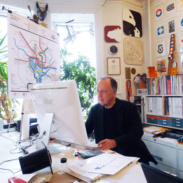
The 79-year-old New York-based graphics revolutionary has long since learnt what design is. Speaking at Offf festival in Barcelona, Wyman ran through his life and work, which has transformed cities and public spaces across the world through the power of iconography.
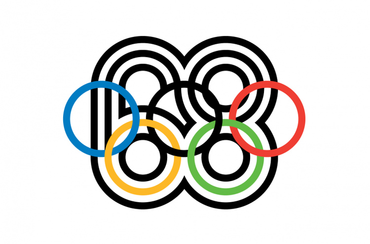
Wyman has worked on some of the 20th century’s most memorable graphics projects, from branding and wayfinding for the Mexico 1968 Olympic and Paralympic Games, to the Washington D.C. and Mexico City metro systems. His work sits alongside that of Margaret Calvert and Jock Kinneir – the designers behind the UK’s road sign system – in terms of accessibility and recognition.
Wyman’s nostalgic pipe dream of the Wild West began to dwindle as his ability with a pencil started to become more apparent. “I wasn’t a very good student,” he says. “But I was the kid in the class who could draw.”
He decided to use this newfound skill to his advantage. As a teenager, he came up with a clever ploy to get an autograph from his favourite American football player Bob Waterfield, which involved sending his wife – 1940s Hollywood actor Jane Russell – a hand-drawn portrait of herself, and asking for both their signatures in return.
To his surprise, Wyman got back a bit more than that. He received a letter from Russell saying his “work showed definite promise”, his first real seal of approval – and given to him by one of the defining female actors of the 20th century.
The designer-to-be continued to sketch and scrawl. Despite not being academic, he was elected class president in high school, which he puts down to the rather minimalist, black-and-white campaign poster he created for himself. He worked 12-hour night-shifts doing manual work in a factory while at college – establishing, perhaps, that he was destined to work with his hands.
Wyman took his skill to college, and studied industrial design at The Pratt Institute in Brooklyn, New York. This was the 1950s, and graphics was an outlandish concept and new art form in the United States then.
“I couldn’t study graphic design because they didn’t teach it at undergraduate level,” Wyman says. “Graphic design had been around in Europe and had just come to the US. It was just starting to be understood.”
He landed his first graphics project after graduating, creating a packaging system for automotive brand Delco. From then, Wyman’s career was on the up. He was asked to create what would become the iconic visual identity for the Mexico 1968 Olympics and Paralympic games. He took the chance – in 1966, he and his newly-wedded wife Neila bought one-way tickets to Mexico. “We didn’t have enough money to buy a return,” Wyman says. “We took a risk.”
It was a risk worth taking as it catapulted Wyman into working within the public sphere. They ended up staying in Mexico City for five years, before returning to New York in 1971.
The project marked a turning point in how graphics began to be perceived by businesses, and the public. The signage for the Olympics had to transcend language barriers, and be understood by people from different countries – so Wyman constructed a wayfinding system without words.
Based on colours, numbers and symbols alone, visitors were able to navigate their way around stadiums. This was not without controversy.
“People used to say that icons on street signs were just for illiterate people,” says Wyman. “I knew that wasn’t true. We had no complaints after Mexico 1968.”

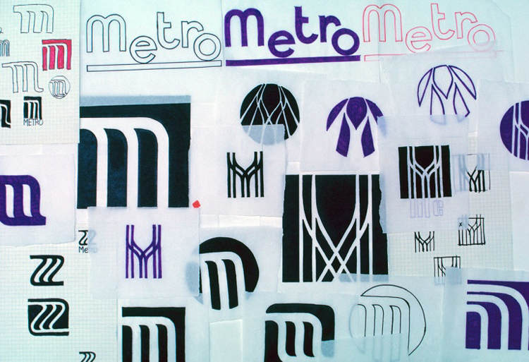
So pivotal is Wyman’s work that communities across the world have adapted it and made it their own. After he created a suite of wayfinding icons for Mexico City’s metro in 1968, Mexican designers were inspired and created an additional suite of icons based on his, having realised their usefulness across the city.
“I created three lines of icons – they added nine more,” says Wyman. “I feel very proud of that.”
Designers aside, the local communities he designs for seem to form an attachment with his work, and see it as part of their identity. His symbols have a political resonance, and have been reinvented by the Mexican public to be used in anti-Government protests against corruption and environmental issues.
Mexico City, Mexico, 2014
For instance, the Mexico ’68 postage stamps Wyman created were adapted by student protesters, replacing the imagery of runners with that of people being beaten – a stark reminder of the tragic Tlatelolco massacre, which saw hundreds of civilians killed by military in the same year as the Olympics.
His work may have also inspired powerful, global design companies we see as influential today. Wyman’s tongue-in-cheek, jovial nature seeps through in his talk when he playfully throws a comparison photo up on the projector between a selection of his colourful symbols created in 1968, alongside that of Apple’s app icons first revealed in 2007 with the launch of the first iPhone.
But why is his work such an easy source of inspiration and adaptation? Because it’s all basic stuff, he says. “A lot of my designs are pretty straightforward. This gives you a lot of power. I enjoy working in a simple way.”
And in turn, he has been inspired by simplicity. He draws comparisons between his own work and ancient Greek pictograms that would have been scratched into walls – traditional wayfinding he sees as design artefacts.
This shows the designer’s ability to react to and be inspired by things in the real world. Wyman’s career did, after all, start with his love for American football and time spent grafting in a factory. Fittingly, Wyman ends his talk by showing a ceramics project he is working on, and encouraging others to be aware of things around them, get away from the computer screen and work with their hands.
“There are a lot of talented people out there doing hand-work,” he says. “We are losing them as they get older. I’d like to see more young designers doing this stuff.”
Wyman’s overarching message is that creativity does not have to be convoluted or complicated. By bringing the humble pictogram into the mainstream, the designer helped to establish design as an accessible art form that everyone can understand and appreciate.
And as the 2,000-strong crowd got up from their seats to applaud the graphic designer – marking the end of Offf 17 and the only standing ovation of this year’s festival – it is evident that Wyman’s decision to ditch the cowboy hat for the pencil was well-made.
Design Week was invited to Offf Barcelona 2017 by Adobe. The festival took place 6-8 April 2017 at the Museu Del Disseny de Barcelona in Spain.
Discover more

-
Post a comment


