Burger King launches “subtle” new interior design – introduces self-ordering kiosks
The new-look interiors are being used at Burger King’s Paris flagship store, ahead of a possible global roll-out.

Fast food giant Burger King is launching a new restaurant design that features self-service kiosks and brand detailing throughout the interior.
The new-look interiors are being launched at Burger King’s Paris flagship restaurant, which the chain says is its 4,000th restaurant in Europe, the Middle East and Africa, and one of its largest in the world.
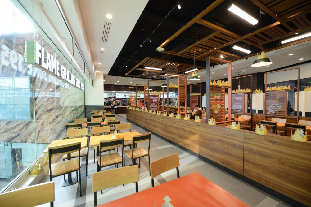
It seats up to 250 diners and features three full kitchens and 12 self-service kiosks.
New look follows Turner Duckworth-designed packaging
It says the new-look interiors will “serve as an additional option” to be rolled out to other Burger King restaurants around the world.
The new-look interiors follow redesigned Burger King packaging, which was created by Turner Duckworth and launched earlier this year.
The packaging redesign is part of a wider Burger King branding project that also covers interior design. Burger King would not say who has worked on the new interiors concept.
Exposed wood and bring and “community tables”
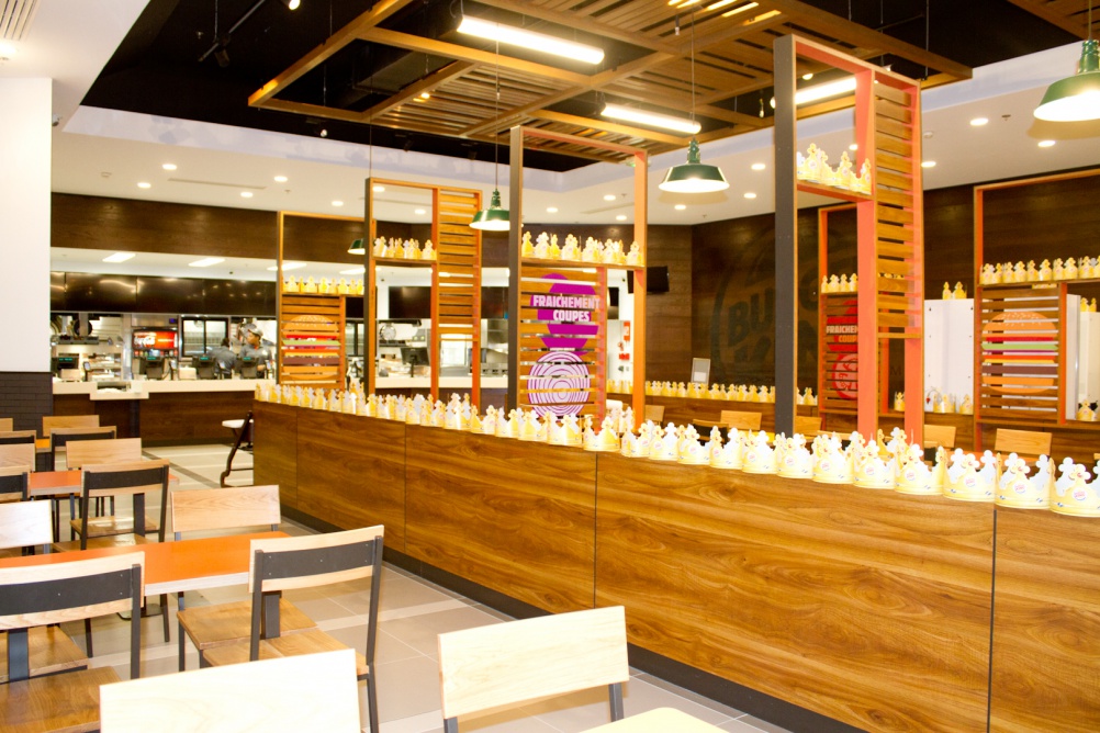
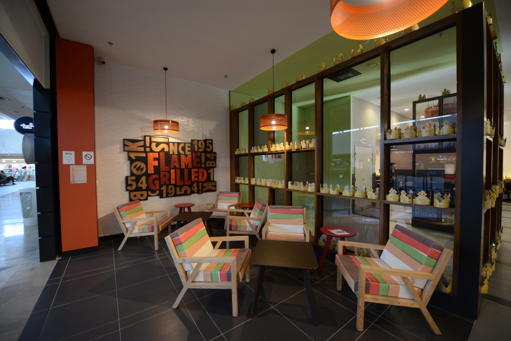
The new interior design brings in a variety of colours and new textures including real wood, metal and exposed brick.
Open ceilings feature exposed venting and lights as well as exposed beams.
There are multiple seating areas including a lounge area, “community tables” and a special area where children can play with digital screens and “interact with the brand in entertaining and fun ways”.
“Subtle cues” to the Burger King branding
Burger King says there are also “subtle cues” to its branding throughout the interiors, such as embossed logos “seared” into solid wood tabletop surfaces and a “heritage wall” replete with photographs showing the history of the brand.
Burger King says: “The contemporary restaurant has a warm and inviting environment that invokes a feeling of nostalgia around the Burger King brand heritage.”
Last year fellow fast-food giant KFC introduced a radical new interior design concept, which it describes as “the future of interior design for KFC”.
KFC and McDonald’s have also looked at their designs
The interiors, which were created by KFC’s in-house team, feature exposed ceilings and textured brick-effect walls as well as photographs and illustrations from commissioned artists that represent the ingredients in KFC’s food.
Butchers block and timber plank kitchen tables are used, as well as loose furniture, while the space is lit by low-hanging copper lighting.
In 2013 Burger King’s rival McDonald’s introduced new packaging designs by Boxer, which feature a “hand-made” look and aim to “change perceptions” of the fast-food giant.
Discover more:
• KFC unveils radical new interior designs
• Boxer aims to “challenge perceptions” with new McDonald’s packaging


Harsh angular profiles, stark regimented layout, it feels reminiscent of a cold school dining room or former soviet peoples canteen… not feeling it I’m afraid.