Ultra X branding looks to drop “masculine” association with marathons
The new ultra-marathon series runs five-day, 250-kilometre races across the world, and looks to appeal to people of all skill levels, whether they are running “novices” or long-distance “experts”.

We Launch has designed the branding for a new ultra-marathon group that looks to be accessible to anyone and avoid the “masculine” marketing associated with similar sporting events.
Ultra X is a new series of “ultra-marathons”, which means any footrace longer than the traditional marathon length of 42 kilometres (26 miles).
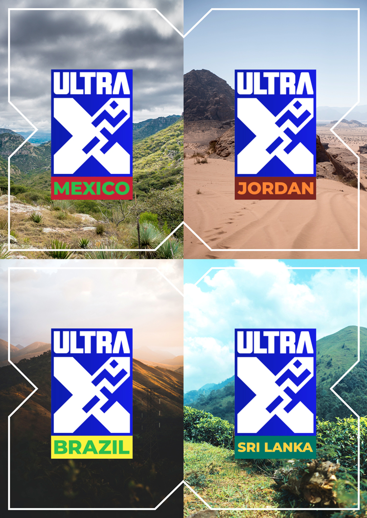
It hosts races that are 250km long in different countries, which take five days to complete. It currently has racing events booked for 2019 and 2020 in Mexico, Jordan, Sri Lanka, Bolivia, China and Azores. By hosting races worldwide, the brand aims to give its runners travel experiences as well as sporting accomplishments, according to Ultra X.
Ultra X was founded by the same people behind the Wadi Rum Ultra based in Jordan, a five-day, 250km trek across the desert.
The new ultra-marathon brand looks to make “multi-day racing accessible to all”, says Stuart Lang, creative director at We Launch, so has three core audience groups: rookies, who are new to multi-day races, allegiants, who have tried them before, and pros, who are “experts” at them.
It also looks to avoid male-orientated design trends – such as a red and black colour palette – adopted by similar brands like popular triathlon Ironman, says Lang.
The logo uses a core colour palette of blue and white and is made up of the word “ultra” set in bold, sans-serif typeface Holmkvist in all-capitals. Underneath this is an “X” symbol, which has a two-dimensional icon of a running person inside it, a carry-over from the Wadi Rum Ultra brand that aims to be a “well-recognised” and “unisex” graphic symbol for running worldwide, adds Lang.
The logo is then adapted depending on the country of the race, with the country name set in the colours of its national flag underneath it.
The “X” symbol in the logo is also blown-up and used as a simple line-drawn framing device, used to hold photography and text. Sans-serif typeface Tasse set in all-capitals has been used as the headline font for copy across the brand, as it is “lighter” and “more condensed” than the “chunky” logotype, says Lang.

Landscape photography from across the world has been used across the marketing, with some advertising posters featuring the global map coordinates of the particular place seen in the photograph in the top-left corner.
“We needed to appeal to all types of runners,” says Lang. “We made the visual language about the actual locations and epic landscapes and chose a colour palette that wasn’t being used in the endurance sport space at all; the blue and white feels calm and serene, it’s almost Scandinavian in feel.”
Lang adds that the brand had to be personalised to each individual country to allow it to “take ownership” of the brand, which is why place photography has been used and a secondary palette inspired by national flag colours.

“Emotive” headlines have been used across the marketing, says Lang, with the overall brand message asking people of all abilities to “explore [their] limits”, by pushing themselves physically while also exploring a new place.
“People build up with their challenges,” he says. “You start with a 5km, then a 10km, then a half-marathon, then a marathon. People get that bug and want a new challenge. Also, people are not forced to run, they can walk or take part in other ways. We wanted this to appeal to novices and rookies, those people who have done a few long-runs and marathons, and the elite.”
Lang adds the caveat that the design studio is “very unlikely” to take part in an Ultra X event any time soon.
Ultra X’s branding is currently rolling out across all touchpoints, including online platforms such as the website and social media channels, merchandise, print materials, print and digital advertising, brand guidelines and a brand film.


All I can see is a low-key Swastika!
Is anyone spotting the inference of a Swastica within the marching man…?
Just me, I guess, but I can’t help but see a mildly deconstructed swastika in the upper-right portion of the X.
Aside from the brutalist use of condensed fonts and raging all capitals, I’m wondering why someone thinks adding a deconstructed swastika over the top of a scottish flag is in anyway ‘feminine’