Fags for the memory
Yesterday’s print ads trigger pangs of nostalgia, principally because print and on-line ads lack the charm and style of their predecessors.
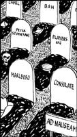
“Consulate: cool as a mountain stream,” went the slogan. To reinforce the point, there was the picture of the mountain stream – it looked, from the jungly vegetation around it, to be somewhere like Jamaica. A team of young, lithe, American types with good hair and teeth, chinos rolled up, were manhandling a Mini Moke across the stream and having a big laugh about it all. Why don’t they make ads like that any more?
The Consulate ad ran for years and years, virtually unchanged, on the back of every colour supplement, glossy mag, theatre programme you ever saw. You might still find a version of it in the unreconstructed pages of in-flight magazines. Consulate, for those who don’t remember, was a mentholated cigarette. You never knew anybody who smoked them, but presumably millions did. Like the Marlboro cowboy, the Consulate guys ‘n’ gals sold smokes as lifestyle accessories. It was meant to be exotic, like the Blend 37 instant coffee ads you found in all the same mags. And still do, since coffee hasn’t yet been banned from most publications as ciggies have.
Other cigarettes sold themselves on technology. Kent, for instance, with the crush-proof pack and the famous Micronite filter, unless I’m confusing that with another brand, like Peter Stuyvesant or Rothmans. What do I know? I’ve scarcely smoked a cigarette in my life, let alone bought a pack. But I remember the ads. As with Parker Quink (“contains Solv-X, the ingredient that cleans your pen as it writes”), they defined a period, had a certain look and now, of course, a na’ve charm. This exercise in nostalgia has been brought on by the growing conviction that there is no equivalent school of print advertising defining the times we live in now.
Try it yourself. What was the last memorable ad you saw in print? Meaning display ads, of course, not the perennially fascinating, usually design-free small ads? Not sure? Don’t go hunting through the magazines. I’ve done that job for you. Believe me, there’s virtually nothing. Rifling through the Sunday glossy-colour sections, for instance, yields the following:
1. An ad for a Range Rover. It’s shown in rough terrain. 2. An ad for a Jeep. Ditto. 3. An ad for a Peugeot MPV, set in front of a Cotswold farmhouse. 4. An ad for a Renault Laguna, set in front of a Nash terrace in London. 5. A ten-page sequence of ads for Mazda cars. On each page, the car in question speeds through verdant fields, scattering dandelion seeds in its wake. 6. Soft-focus ads for M&S women’s vests with built-in bras. 7. The official Royal Mint commemorative coin of the Queen Mother. The coin is photographed on what may be crumpled red silk. 8-94: Ads for book clubs, wine clubs, leather sofas, buttoned divan beds, worming treatment for cats…
All such current examples of the adperson’s art are so unoriginal – with the possible exceptions of those for a couple of youth-oriented drinks, namely Boddington’s beer and Tango – but none is quite so bad as the one which, I now realise, set me off thinking about Consulate and its mountain stream. There is a car called a Honda Civic Tropica. The adfolk clearly had an eight-day brainstormer over it. They emerged with the idea of the car – get this – being paddled on a raft down a tropical river by Amazonian-style Indians. A computer-manipulated crocodile snaps its jaws nearby. That’s it. Tropica = tropical. You see it in every mag, and on a million billboards, too. The setting only serves to highlight the dullness of the vehicle being advertised.
Because Hondas, as everyone knows, are bought only by pension-drawing members of the National Trust.
Things are no better when you go to the on-line versions of magazines and newspapers. Are you ever impressed by a click-on ad there? Don’t be silly. I know this may not seem important, but I’ve noticed this: whenever you look at old newspapers and magazines, what catches your eye most is not so much the journalism as the graphic design of the ads. As I’m a journalist, I’m allowed to say this. Changing fashions in advertising give us a valuable historical perspective.
But I can’t find a 2000 style for print ads. In any other field of design, I think we’re OK – the historical archive is being laid down nicely. But it seems as if the people in the ad agencies never recovered from their hangover after the 1980s. Their brains stopped working. Which is why “Consulate: cool as a mountain stream” is now ironically retro-chic. Remember the Saatchi brothers launching themselves with a full-page ad in The Times proclaiming “It’s time for a new kind of advertising”? They were right then. Trouble is, if they said it today, they’d still be right.
-
Post a comment


