The Netherlands reveals new identity and drops “Holland” for good
The updated international logo is a “true reflection of the Dutch mentality” and is central to a brand strategy based around openness, inventiveness and inclusivity.
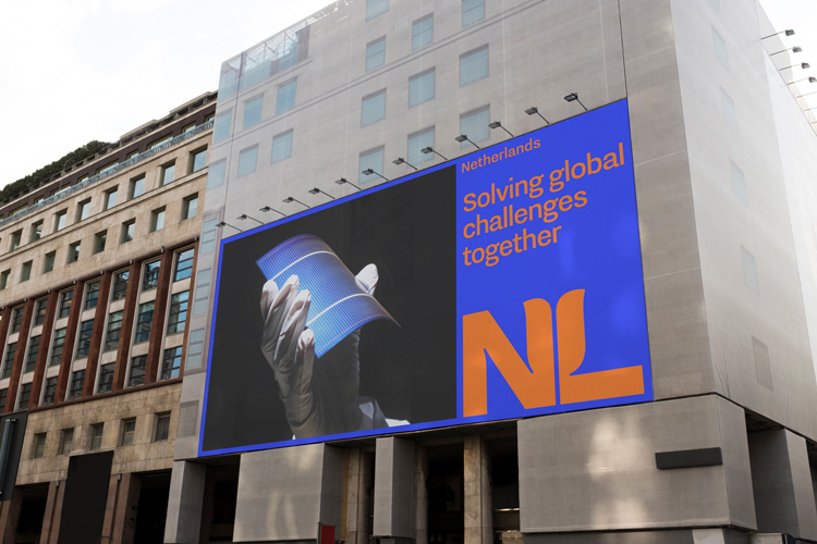
The Netherlands has unveiled a new international logo, created by Dutch design consultancy Studio Dumbar.
The logo is how the country will be recognised internationally from now on, and part of a wider update to the country’s identity.
The updated logo — which cost £170,000 — retains the previous design’s orange colour, a shade associated with the country’s royal family, the House of Orange.
While the old logo featured an expressively drawn tulip, the new logo embeds the Dutch icon in a more subtle way through the use of negative space.
The N and L lettering forms a silhouette of the tulip’s petals. “The logo is intriguing, but at the same time solid and straight to the point,” Studio Dumbar tells Design Week.
In this way, the logo is “a true reflection of the Dutch mentality”, according to the studio.
A neater typeface has been used for the country’s updated name, which features alongside the tulip design in the full logo.
Designed by Dutch foundry Bold Monday, Nitti Grotesk is an “idiosyncratic” typeface that can “communicate both professionally and expressively”, Studio Dumbar says.

When the logo is used in conjunction with a member of the country’s kingdom, like one of its six Caribbean islands, ‘Kingdom of the Netherlands’ will be used.
The new logo can be used now, though the full branding identity including a website and visual guidelines will roll out from the beginning of next year.
NL Brand
Before the logo, the most significant part of the branding update was the official change of name from ‘Holland’ to ‘the Netherlands’.
The overhaul — known as the ‘NL Brand’ — is defined by three core concepts according to the government; openness, inventiveness and inclusivity. The strategy aims to convey the country’s strengths as well as encourage collaboration with other countries.
The head of Foreign Trade and Development Cooperation, Minister Kaag says: “The new logo can be applied across a range of fields, from high tech to agrifood and from sport and culture.
A clear cut international image is positive for our exports and the attraction of investment and talent.”
Holland vs. The Netherlands
There has been confusion over the country’s name change since it was announced in October.
In a release about the new branding strategy, the government says: “Naturally we are not banning the use of the word ‘Holland’, but we have chosen to stop using it on our official communications and products.”
“From now on the logo will be the letters ‘NL’ accompanied by ‘the Netherlands’ because ‘the Netherlands’ is the proper name of this country.”
The branding might run into some problems with translation; while ‘the Netherlands’ has a literal translation in nine languages, in some languages it is much rarer. In those cases, ‘Holland’ will still be used.
Read this next


So the Netherlands is the Dutch name, not Nederland? Or does the article only cover the English language version?
Hi Dean, Thanks for your comment. “Netherlands” is how the brand is expressed in all instances. It’s used internationally and for tourism. (The government website uses the same term).
Whilst it may not be seen in its external marketing The Netherlands, often mislabeled as Holland, is definitely not dropping the name. The country is divided into four regions, known as North, South, West & East – with West Netherlands made up of four provinces Utrecht, Zeeland, North & South Holland.