Zoopla rebrands to show the “complexity of the home buying process”
The property website has revealed a rebrand, including a new logo, typeface and shift of its signature purple shade.
Property website Zoopla has unveiled a rebrand which hopes to reflect the “complexity of the home buying process”.
Brand consultancy Zag has designed the new look, which comprises an updated logo, change in the signature colour as well as a new visual system.
It has been designed in collaboration with Zoopla’s in-house creative team.

Zoopla was established in 2007 as a property platform for buyers, sellers, renters and landlords. It emerged as one of the leading property websites in the UK and in 2018, it was bought by a US private equity firm.
The rebrand was driven by this growth, according to Zag executive creative director Neil Cummings.
“When Zoopla launched in 2007, it was the original prop tech distruptor but the brand needed to evolve to support its huge plans for the product and digital experience,” he says.

The studio was briefed to “help Zoopla get its mojo back”, Cummings adds, and to incorporate “that human spirit, joy, warmth and playfulness that the competitors don’t have”.
It also needed a visual language that would allow customers to engage with Zoopla’s new innovations and features and “keep them engaged in a richer wider world of Zoopla content”, he says.
Journey Lines

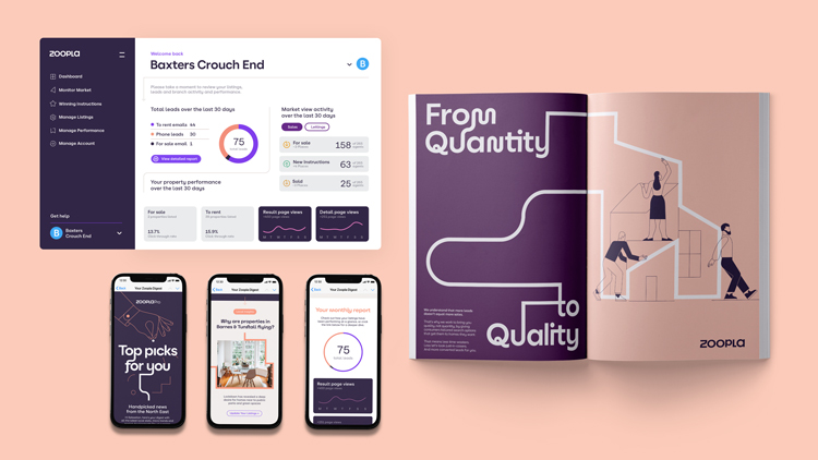
The underlying feature of the new design system is called Journey Lines. “The Journey Lines started life as this guiding element through the Zoopla experience,” Zag design director Dan Green says. “The way it moves and behaves was designed to visualise the home buying journey, and how Zoopla was the constant.”
This system extends to the illustration style and wider graphic language, which includes infographics and guides for customers.

The interconnecting visual style hopes to show “complexity of the home buying process”, Green adds. “The twists and turns, welcome surprises and not-so-welcome-ones, rational decisions and emotional gotta-make-it-happens that change someone’s direction completely.”
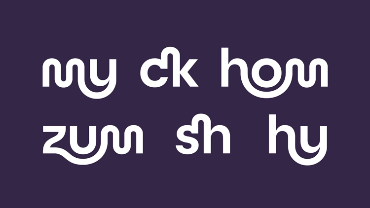
The Journey Lines system was also the inspiration for the new typeface, developed with London and Sydney-based foundry Family Type. This provides a “connected thread throughout the whole identity”, Green adds.
Designing the new logo

The redrawn wordmark uses the custom typface, while the ‘z’ icon is applied elsewhere, on merchandise like laptop stickers. There was a lot of exploration around this in the rebrand, according to Zoopla design lead Gabriel Weichert.
“We wanted to ensure the Z was still unique on its own,” he says, though the team also wanted to make sure the logo was identifiable as part of the Journey Lines concept.
The typeface more generally is reflective of the housebuying process as well, according to Weichert. “It’s reflected in the range of forms; sharp turns and flowing curves and the combination of upper and lower case characters,” he says.

The branding will roll out on Zoopla’s app and website, which will offer new features and products for customers, developed by the in-house design team.
One of these features is called My Home, a hub for homeowners which seeks to provide them with the skills, knowledge and insight on the property owning journey.
Building on a “purple heritage”

One of the most recognisable features of the Zoopla brand is its purple colourway and Weichert says that the shade “will continue to be core to the Zoopla brand”. It has however been adjusted for the new identity.
“We didn’t want to throw the baby out with the bathwater, as there’s a lot of equity in purple for Zoopla,” he adds. “We just wanted to give it a bit more oomph.”
As well as using a “brighter, fresher” primary tone, a secondary palette has been added to give the brand “more room to stretch and play”, Weichert says.
“We have built on our purple heritage, with a brighter, fresher tone for more cut through, and a darker more sophisticated one to connect to our more business-led audiences,” he says.
The designer says he hopes that this provides a “bit more Zoopla-iness” for the new identity.
What do you think of Zoopla’s rebrand? Let us know in the comments below.


Very reminiscent of Yahoo! Not sure if that’s a good thing. Don’t they want to ditch the young playful tech startup image and reassure homebuyers that the process doesn’t HAVE to be chaotic?
I am really impressed by the new brand – they’ve really thought carefully about what it means to be a ‘home-owner’ in 2021 and the new colours/visual assets are really captivating, bright and bold. I do think that perhaps there should have been more consideration for the rental market though – not everyone will be able to be (or may want to) a home-owner and this is important to recognise too. Although this may have been considered behind the scenes! Overall, grand job & a beautiful new website.