
Studio Output’s “provocative” identity for the Alfred Landecker Foundation
A new editorial identity and website for the democracy-orientated organisation hopes to inspire action over apathy.
Studio Output has created the new branding for democracy action and research group the Alfred Landecker Foundation (ALF) which aims to “provoke action”.
The London-based design studio has created the new visual identity and website for the organisation, including a monogram logo and a series of pictograms.
ALF was set up by the Reimann family after research showed an ancestor’s associations with the National Socialist regime in Germany. It is named for Alfred Landecker, a Jewish war veteran who was deported to a Polish ghetto in 1938. His daughter had three children with Albert Reimann Junior, an antisemitic National Socialist – a relationship which ALF says is “difficult to fathom”.
The Berlin-based organisation seeks to promote democracy and protect minorities through research and partnerships with academic institutions, with a digital focus.
“The frailty of democracy against the chaos in the world”
The new identity and website aims to “provoke action”, says Studio Output senior strategist Bahar Shahidi and senior digital designer Sam Hodges. They explain: “The project is designed around the tension between two principles: The frailty of democracy against the chaos in the world, and a call-to-arms to build a civil response and do better.”
The visual identity incorporates a deliberate mix of typefaces, angles and colours to create an experience that “isn’t always comfortable”, according to the designers.
One of the key focuses of this was the newly-designed monogram. The logo was important to represent the organisation and also as a shorthand because the full name is very long, according to the pair.
The monogram – which uses both heavy and fine lines – is inspired by “an idea of frailty”, they explain. “The hairline strokes are resisting pressure from the outside, and showing strength in their apparent weakness.”
Serif typeface Canela and sans serif Beatrice have been used to denote “academic rigour” and “more activist, action-oriented” themes respectively, Shahidi and Hodges say.
They add: “The typography is set at deliberately jarring angles. This makes a big impact and again gives a sense of things being unsettled and off-balance.”
An “urgent and relevant” website
The website is designed to make the subject matter feel both “urgent and relevant”, according to the design team. “Rather than burying the content under academic language, it leads front and centre with a ‘what, why, who’ navigation,” the pair adds.
The ‘what we do’ section is divided into “five powerful pillars”, all linked thematically by topics such as ‘Protect minorities’ and ‘Combat antisemitism’, Shahidi and Hodges explain. “Being direct means no subjects are taboo, so you feel less guarded and more curious to explore,” they add.

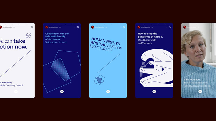
Overall, the user experience is “deliberately editorial, rather than academic”, the pair says. Some articles are “immersive”, for example, with colour shifts and image reveals as readers progress. Custom typography modules also allow statements to be displayed at “jarring angles”, they explain.
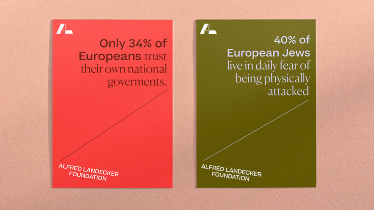
Some academic practices have been retained, such as footnotes as a way to “show rigour and provide credibility”. Within this system, different colour pairings are used to signal content which is more academic or provocative.
The studio has also created a series of pictograms which illustrate more abstract concepts such as democracy and power. These designs can also be expanded into backgrounds for articles where images may not be available.
When there’s no homepage takeover, the designers explain that an experience will start which shows “provocative stories and statistics, with the original source always references”.

An eclectic mix of illustrations has been designed for the website – reminiscent of those used in a “thought-provoking publication” – which seek to express “the idea of many voices contributing to the debate”, the design team says.
“Each illustrator had a different brief relating to content, but everything is deliberately graphic and hard-edged,” Shahidi and Hodges add.
What do you think of the new identity for ALF? Let us know in the comments below.

-
Post a comment


